[:en]

Dolce Stil Criollo – Extraordinarily Aptropaic
GET YOUR COPY HERE
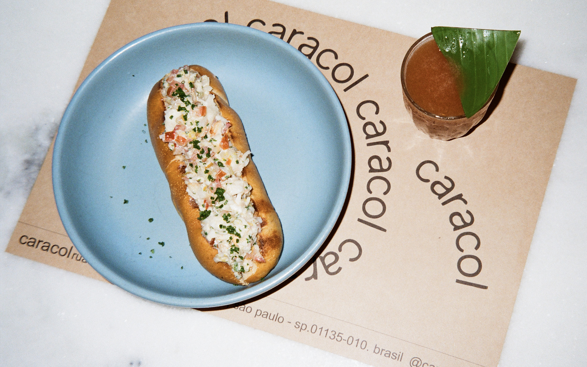
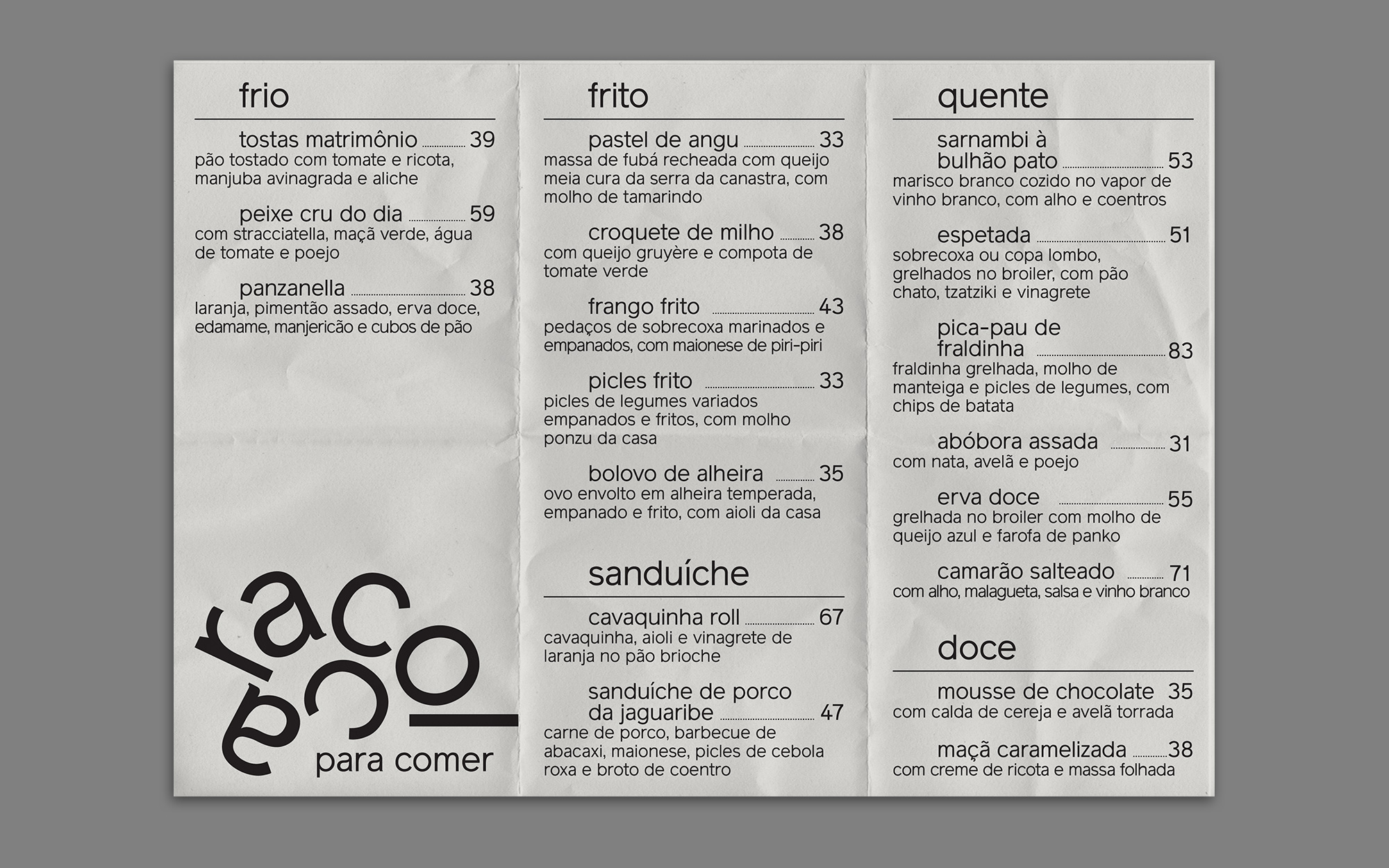
When Caracol told us a year ago that they would have to move out from their original address we couldn’t help but be sad, as this surely marked the end of an era in São Paulo. Gladly they soon found a new spot; bigger, cooler and very promising. To mark this new phase of the bar, they have decided to also refresh their identity and invited us to do so once again.
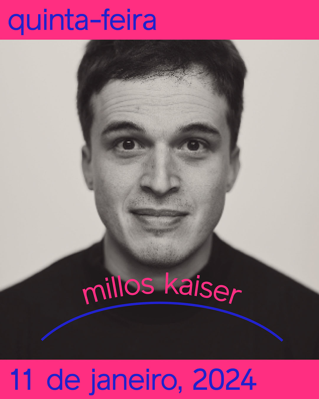
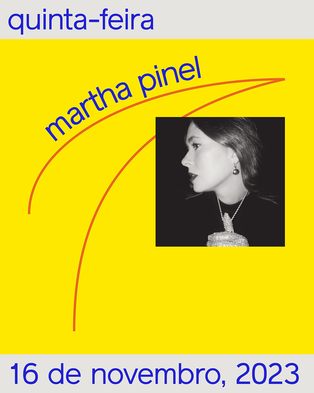
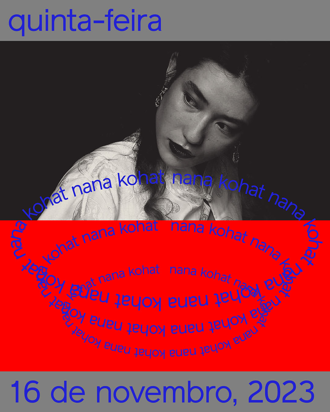
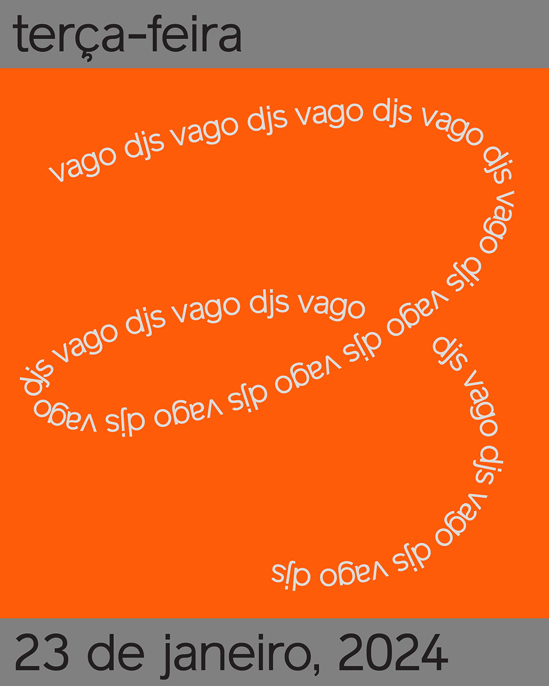
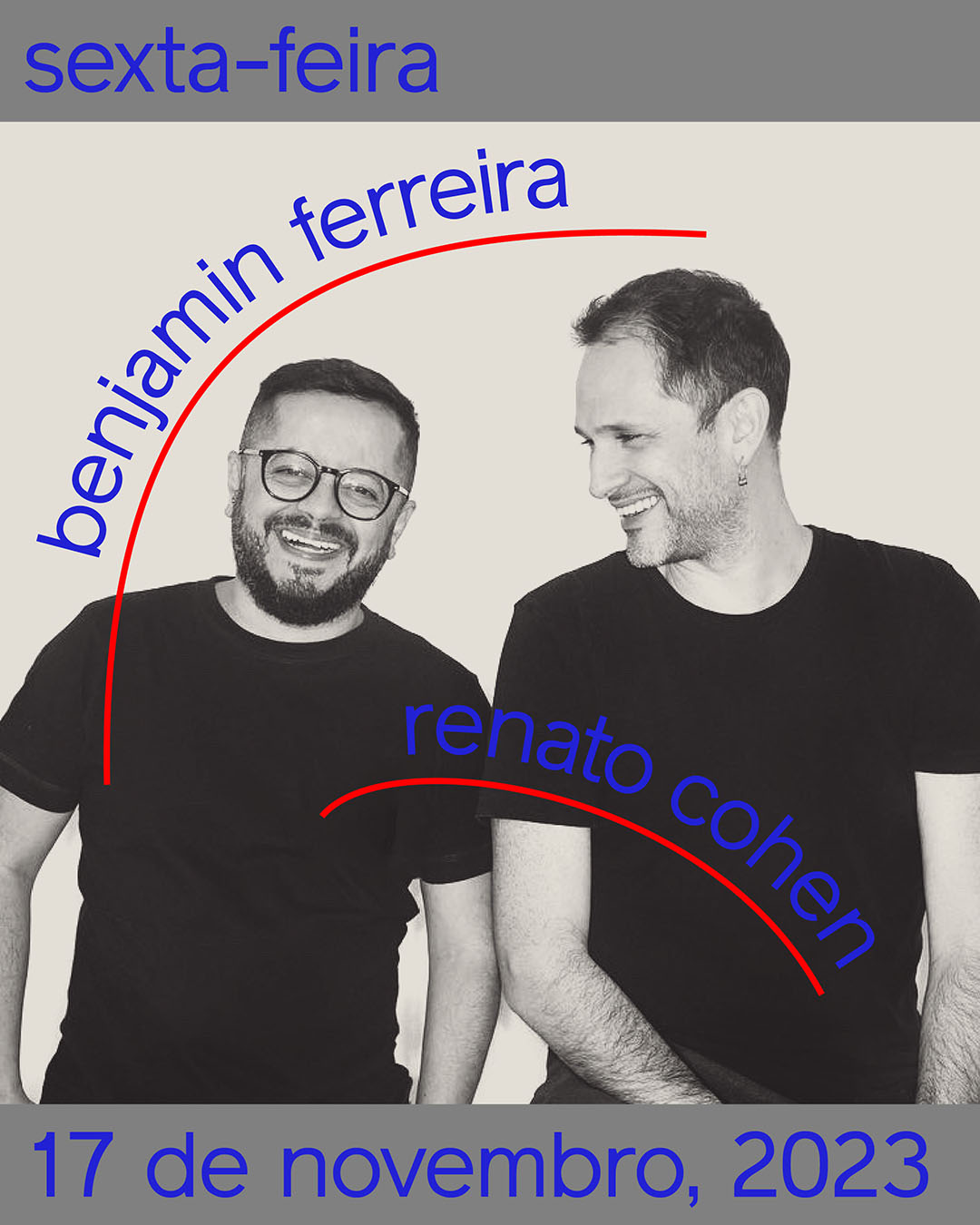
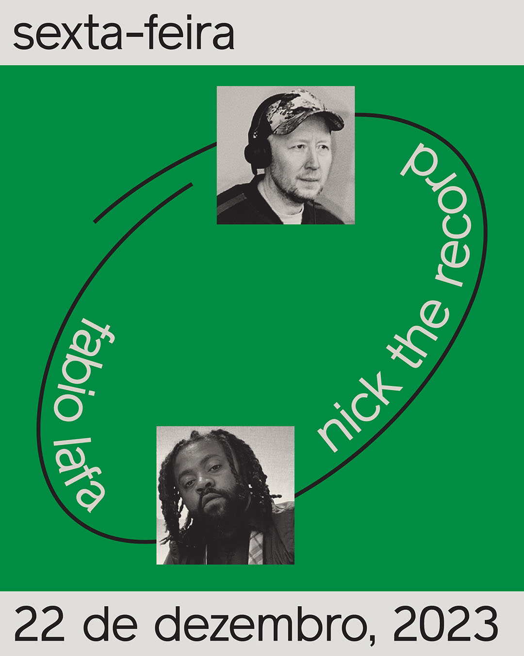
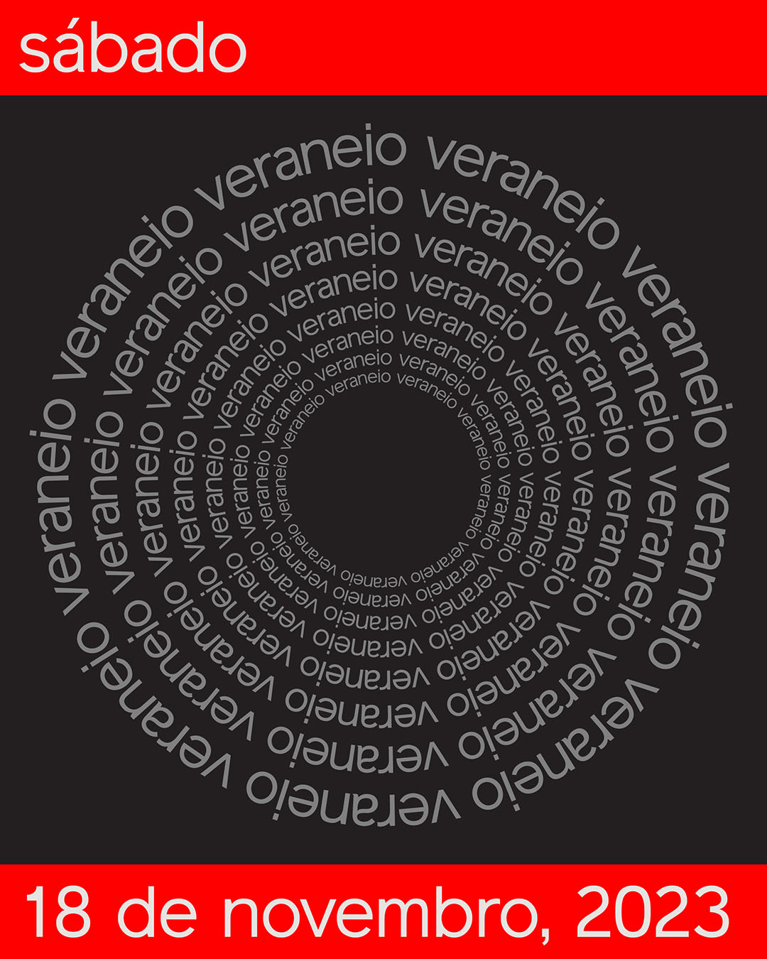
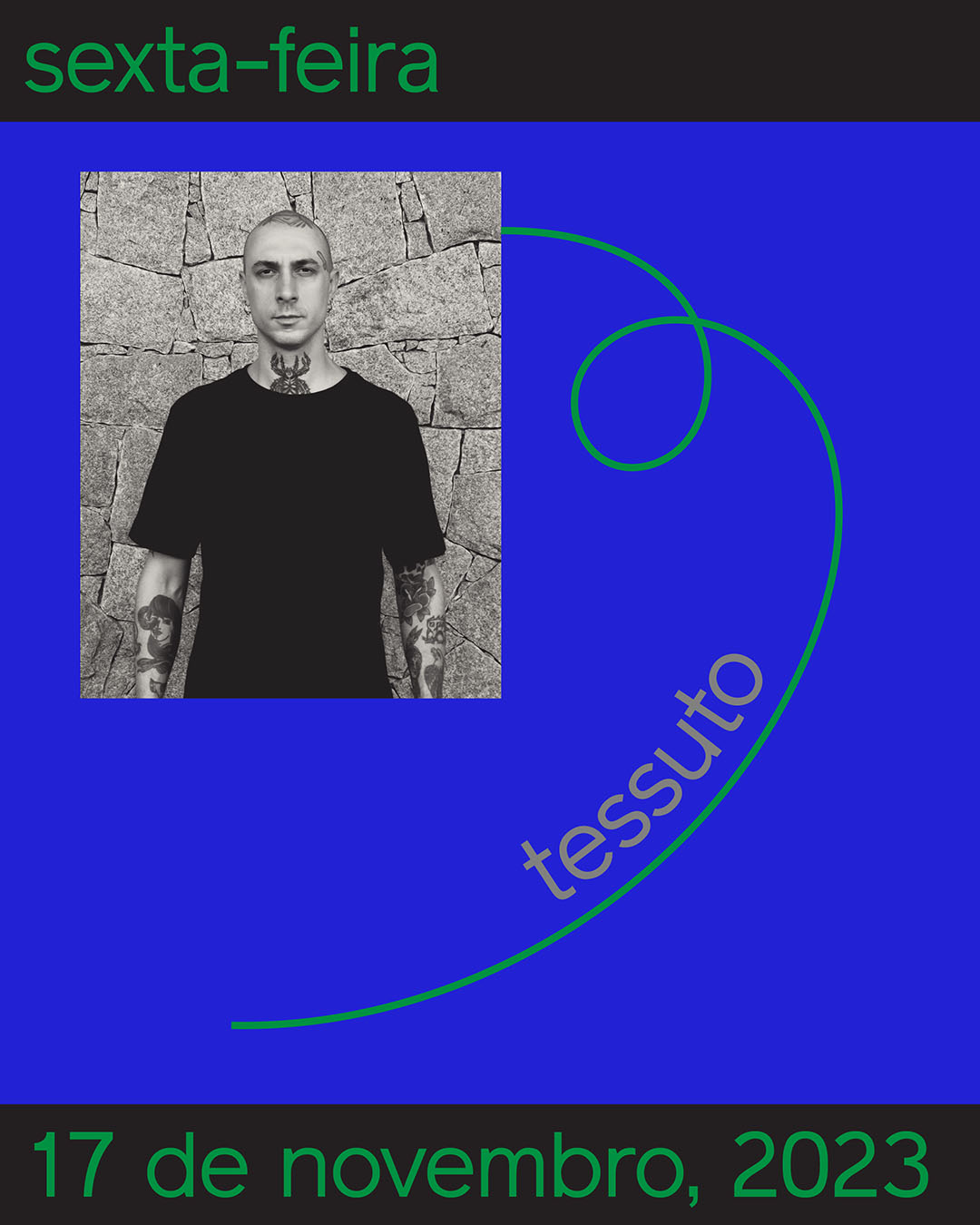
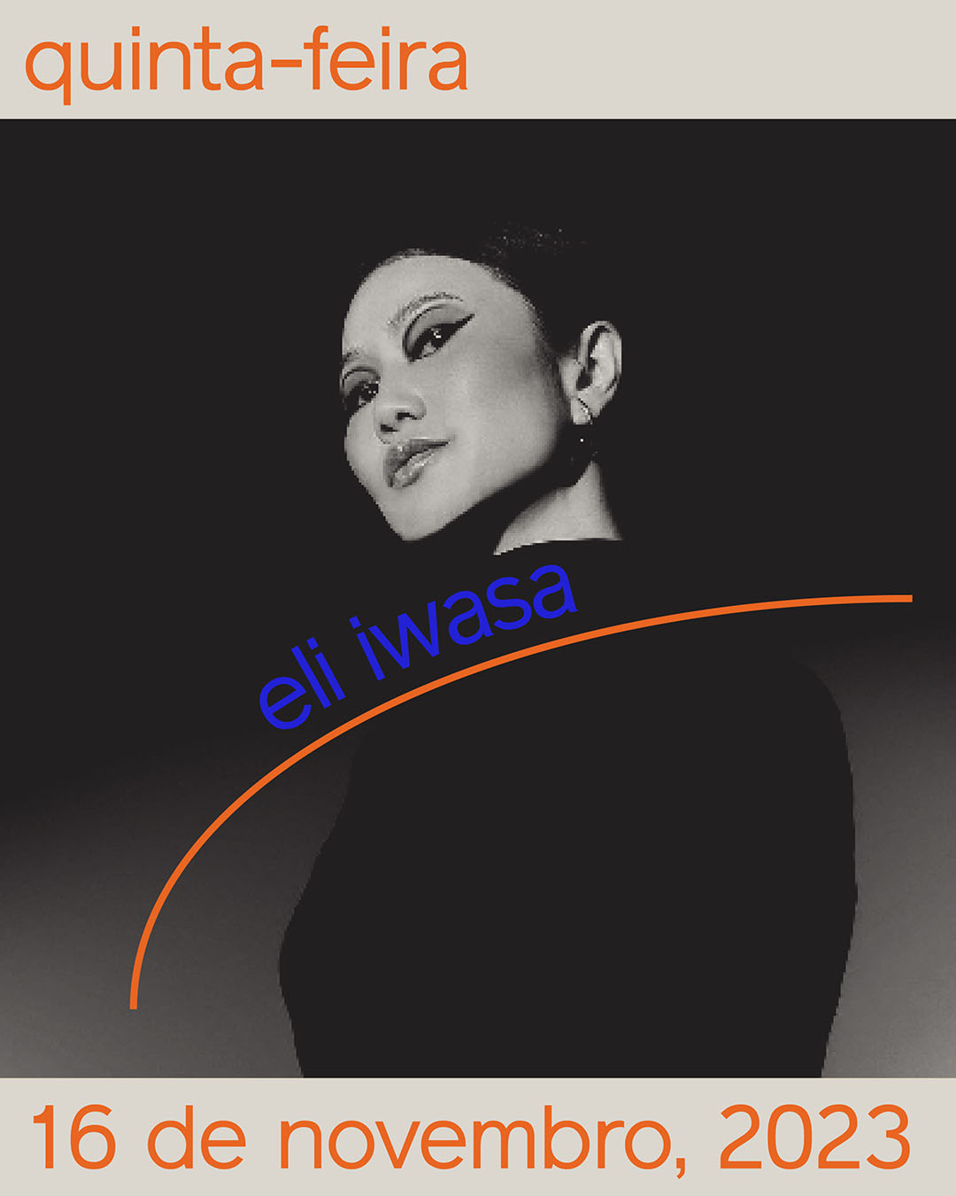
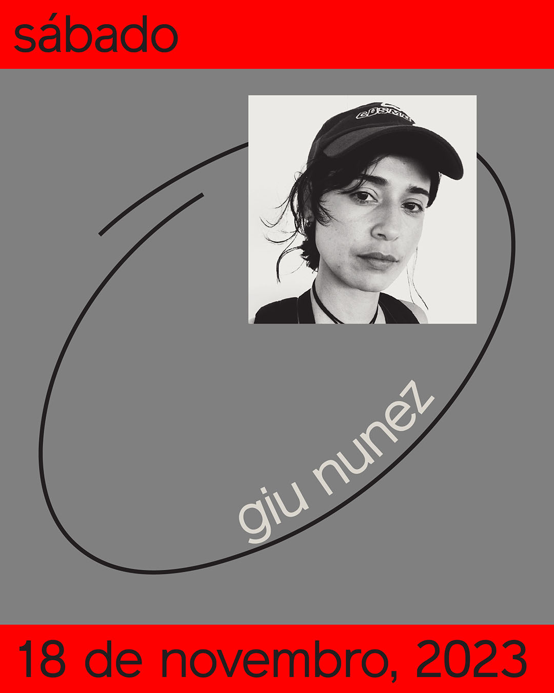
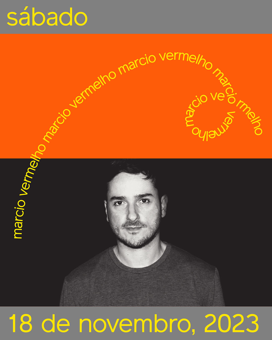
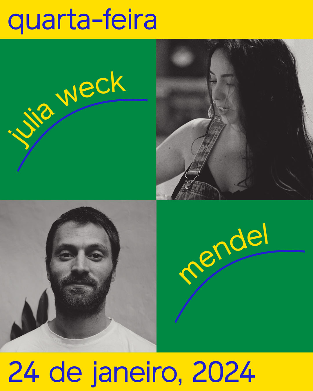
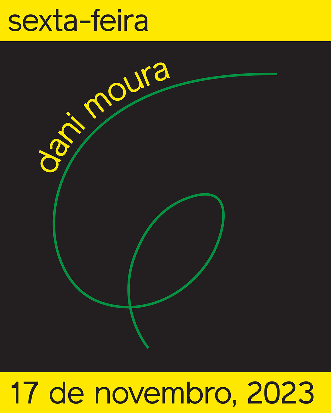
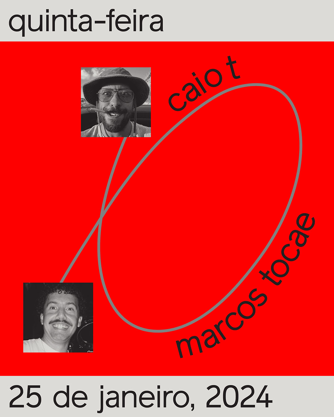
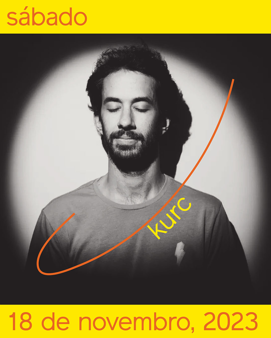
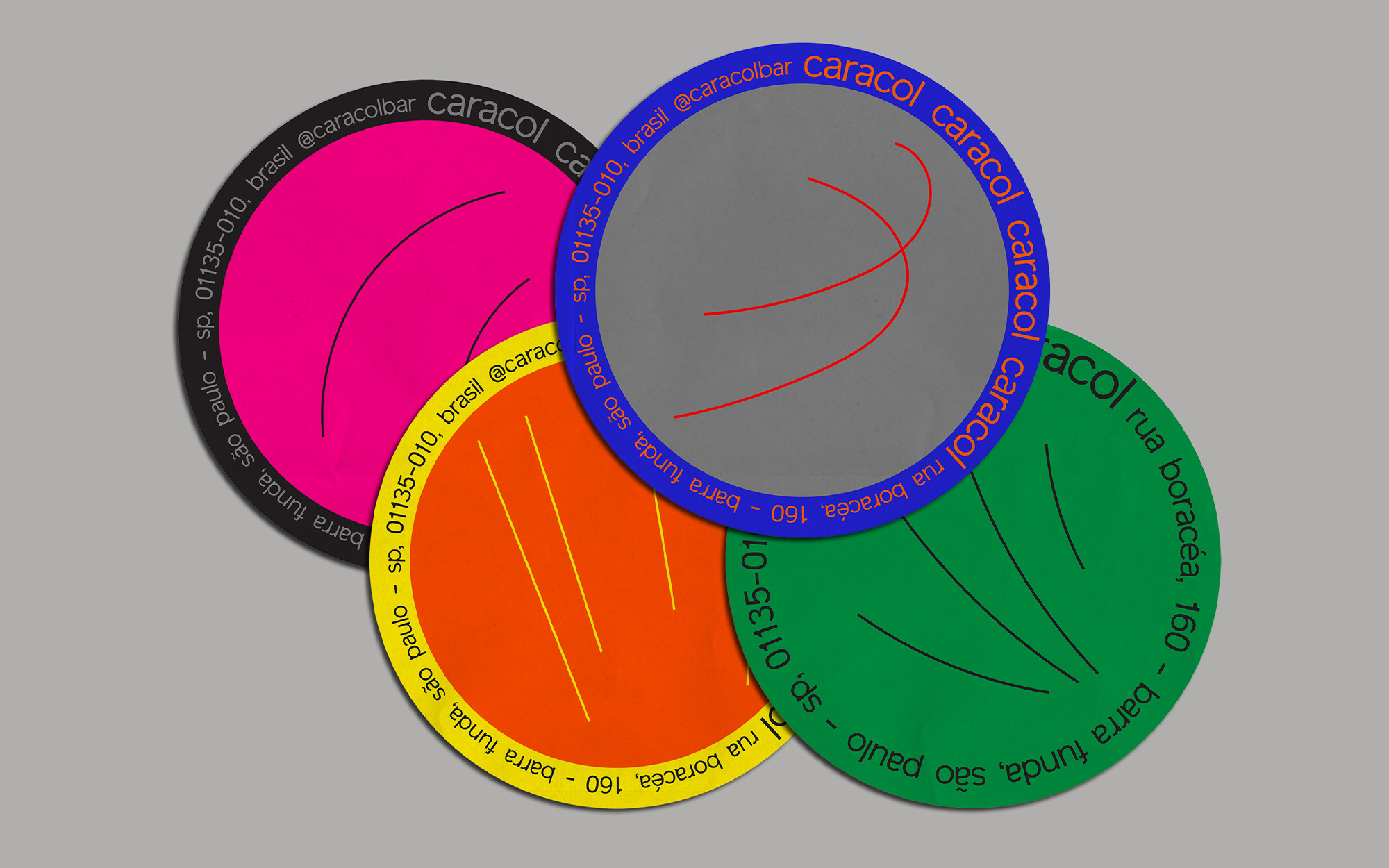
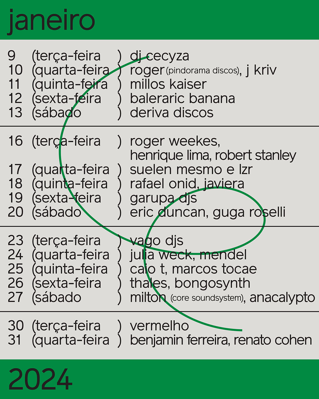
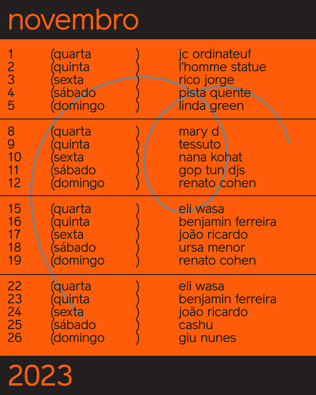
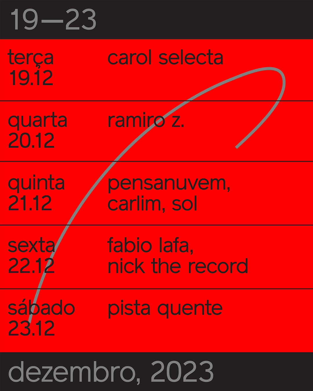
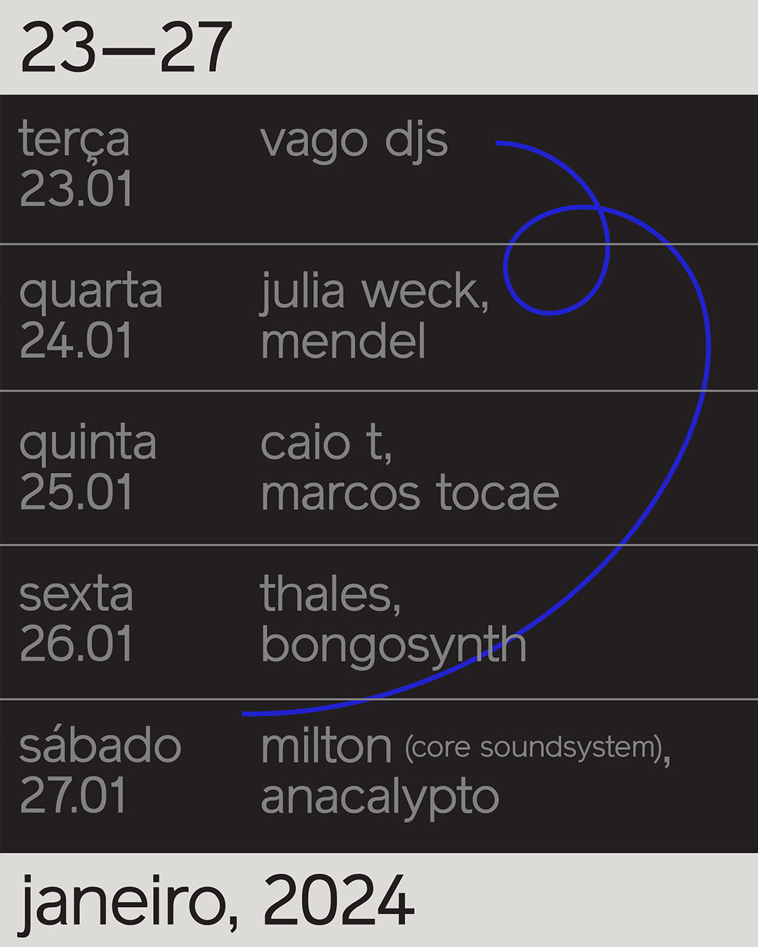
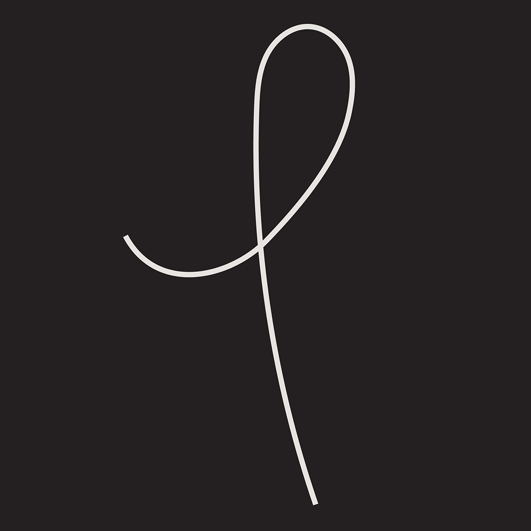
The first ID we designed for caracol 5 years ago was a turnpoint for Sometimes Always and has opened us so many doors. The project had an auto-generative poster design system, which was a pioneer move back then. So the responsibility we’ve put ourselves to come up with something as good as before was immense. We decided to keep the same typography and colour palette, but instead of circular shapes (that very abstractly represented the snail) we’ve chosen to work with lines (made out of stroke or out of text) simulating the paths that a snail takes in the soil.
The new ID is much more gentle in a way than before, there are no machines doing the work of the designer. If the new ID will be as successful as the first, only time will tell.
Category: Visual Identity
Location: São Paulo, Brazil
Collaborators: Mateus Acioli
Photographs: Pablo Saborido
Client: Caracol Bar
Year: 2023