AWAYTOMARS
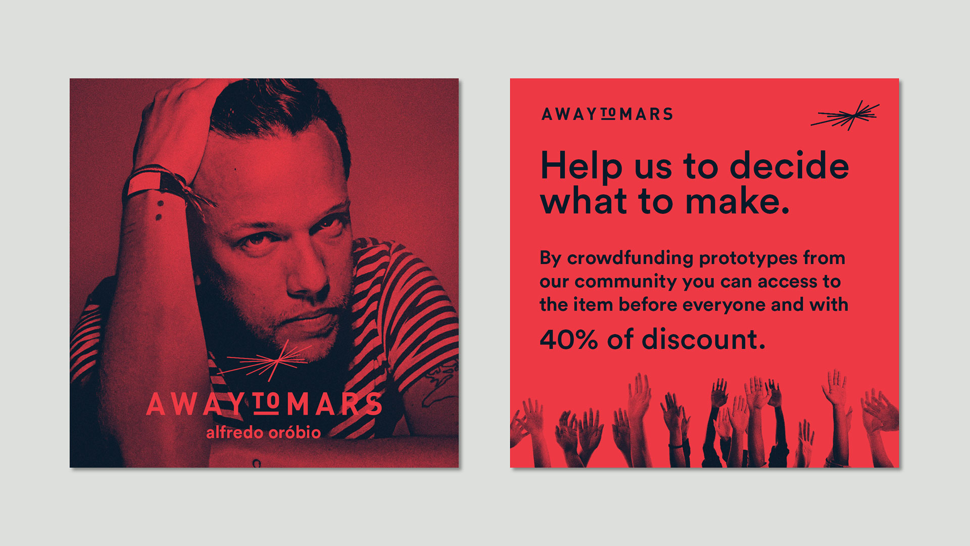
AWAYTOMARS is a clothing community, based in London and Lisbon, founded by Brazilian creative Alfredo Orobio. They design, manufacture, and release new products with the help of a worldwide community. Based in an online platform, AWAYTOMARS users co-design and crowdfund their products into existence within a matter of weeks. By outsourcing the initial stages of the creative process to the general public, AWAYTOMARS allows people to concentrate solely on the generation of innovative and interesting ideas. Their customers are their designers. Their customers are their trendsetters. Together they are building a new way to do fashion.
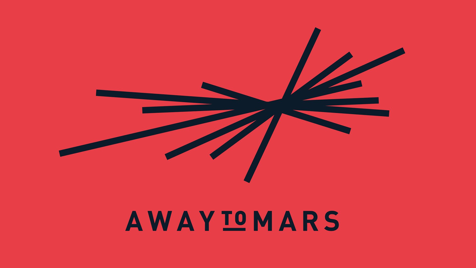
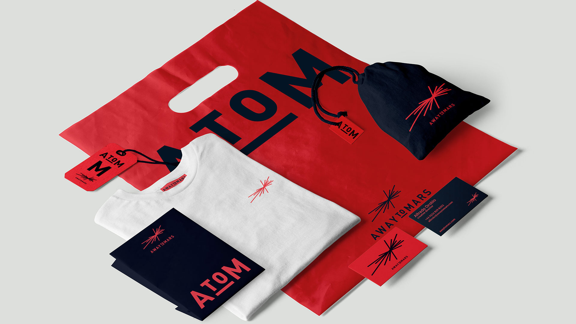
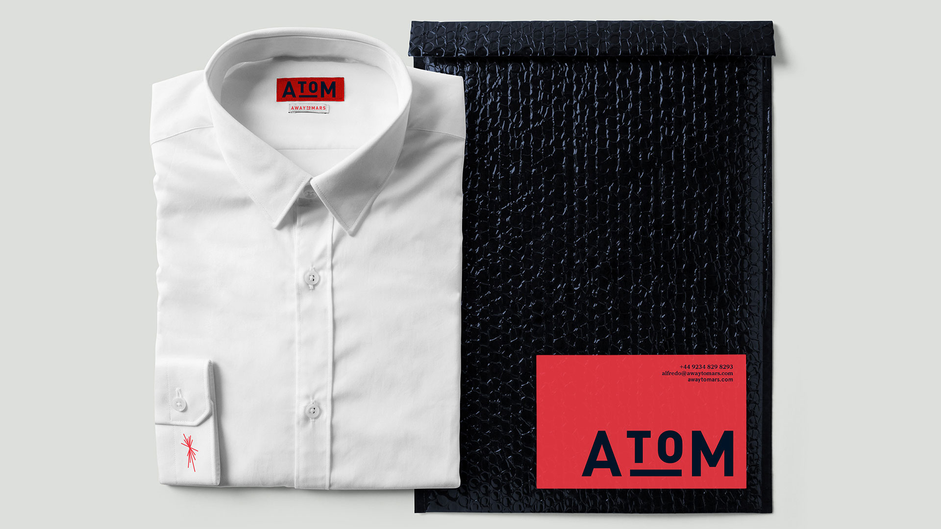
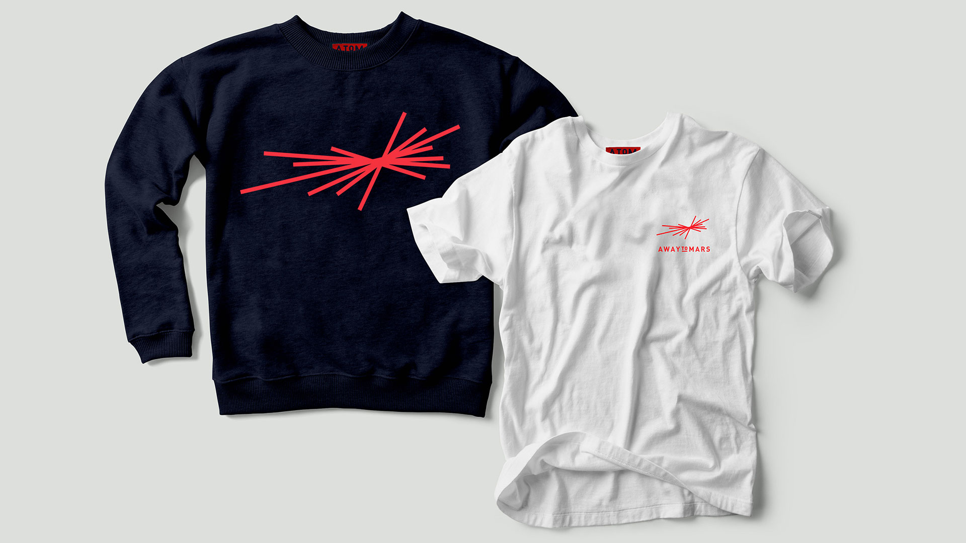
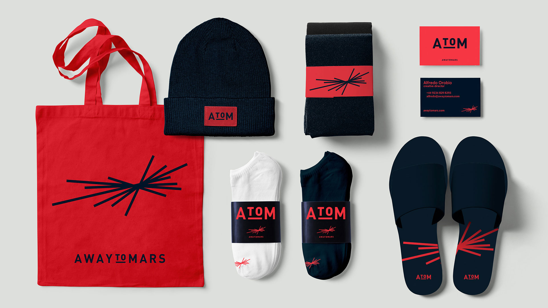
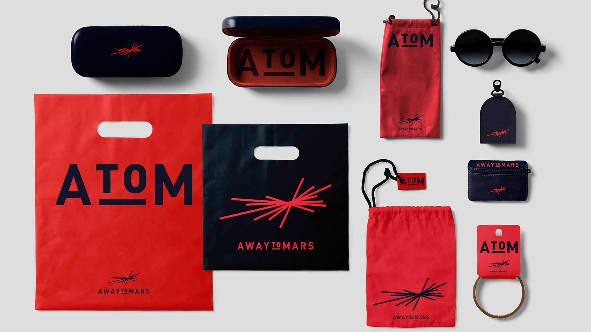
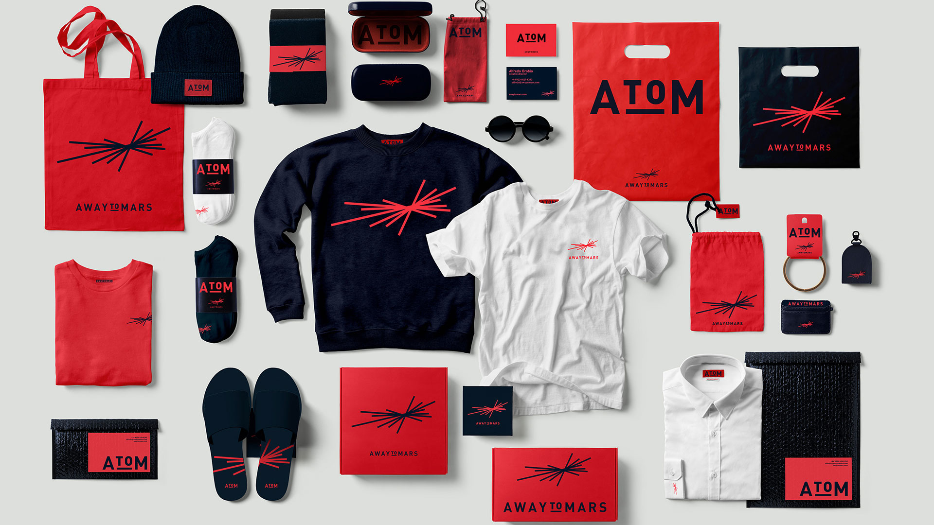
AWAYTOMARS identity was created by putting together botth the characteristics of the project’s name and the concept of the platform itself. The red planet Mars called for a red that is the brand main colour in opposition to a dark blue. The co-creativity is illustrated by an icon made out of multiple irregular lines that converge into a focusing point.
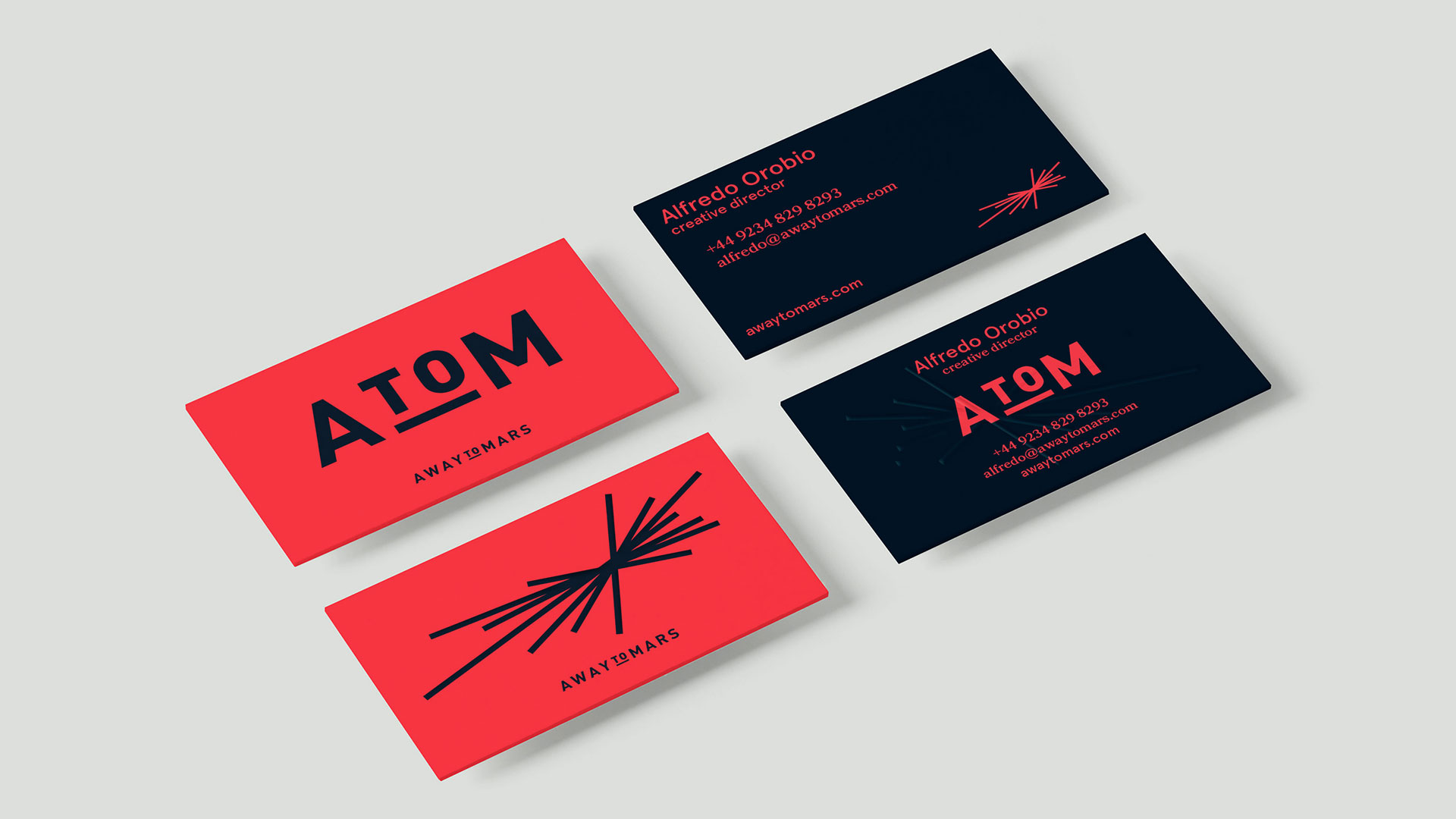
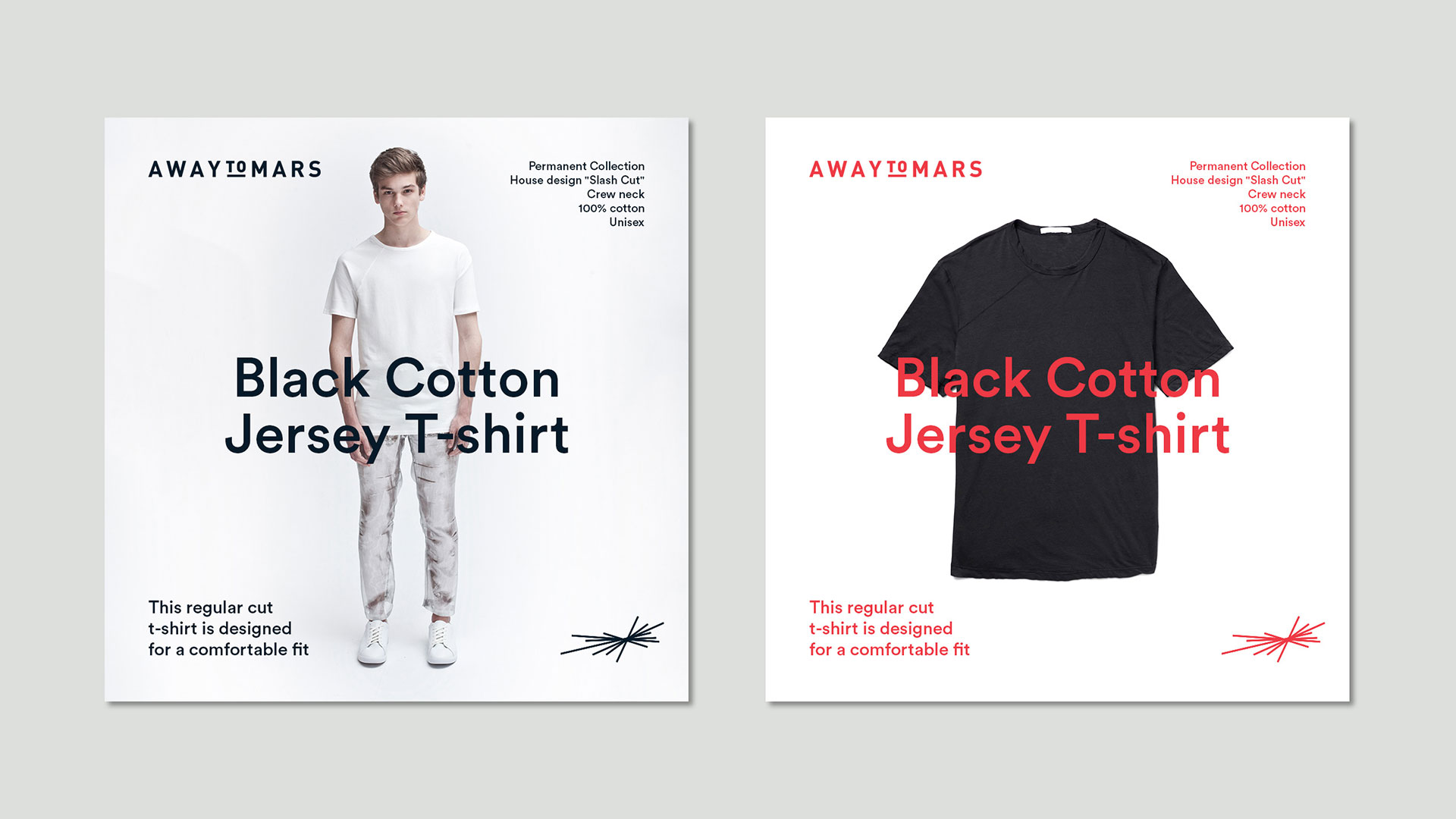
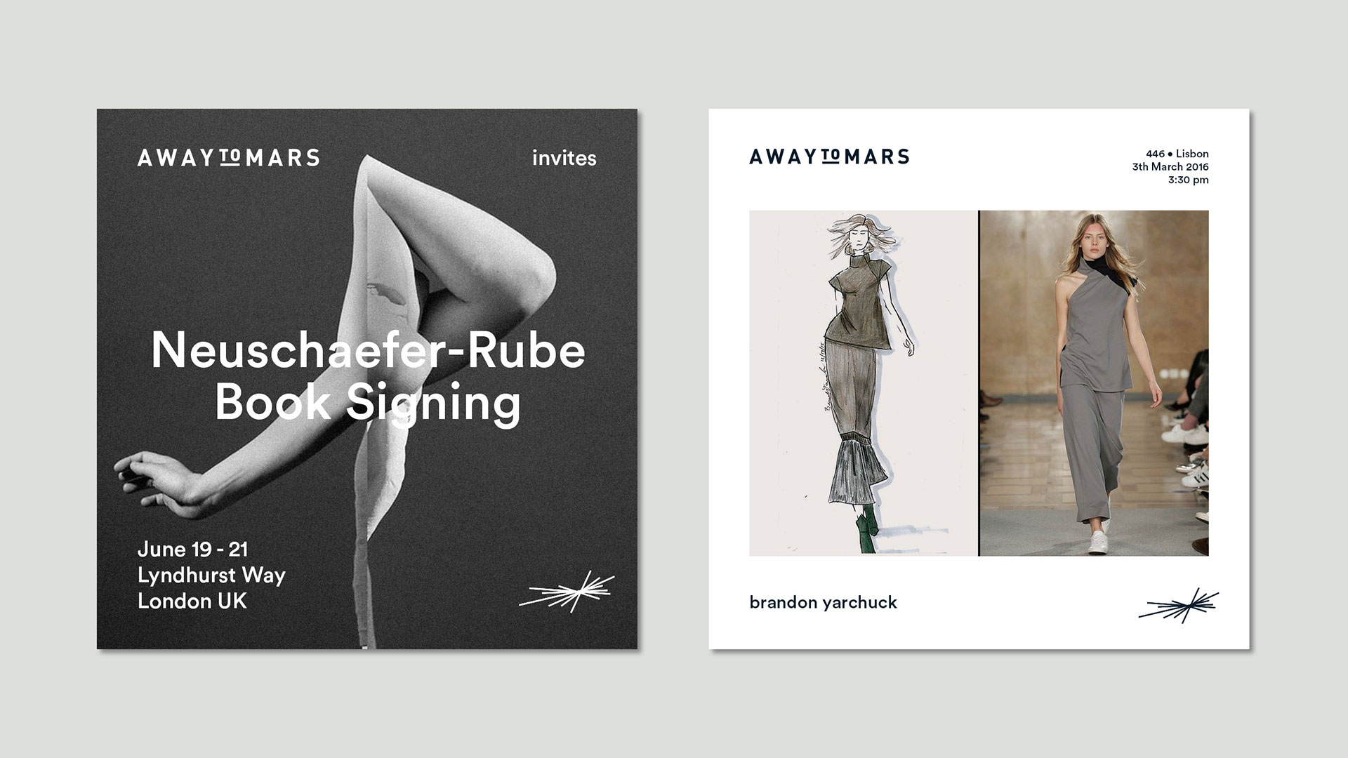
There are many versions of the logo that can be reproduced in varying ways depending on the application – icon only; icon and text; icon, text and collaborator name and acronym. The icon itself has to version, one dedicated to products made by the brand with their inside creative team where the lines has all the same stroke. The other version of the icon is dedicated to products made by collaborators and it has a middle line thicker than the others.
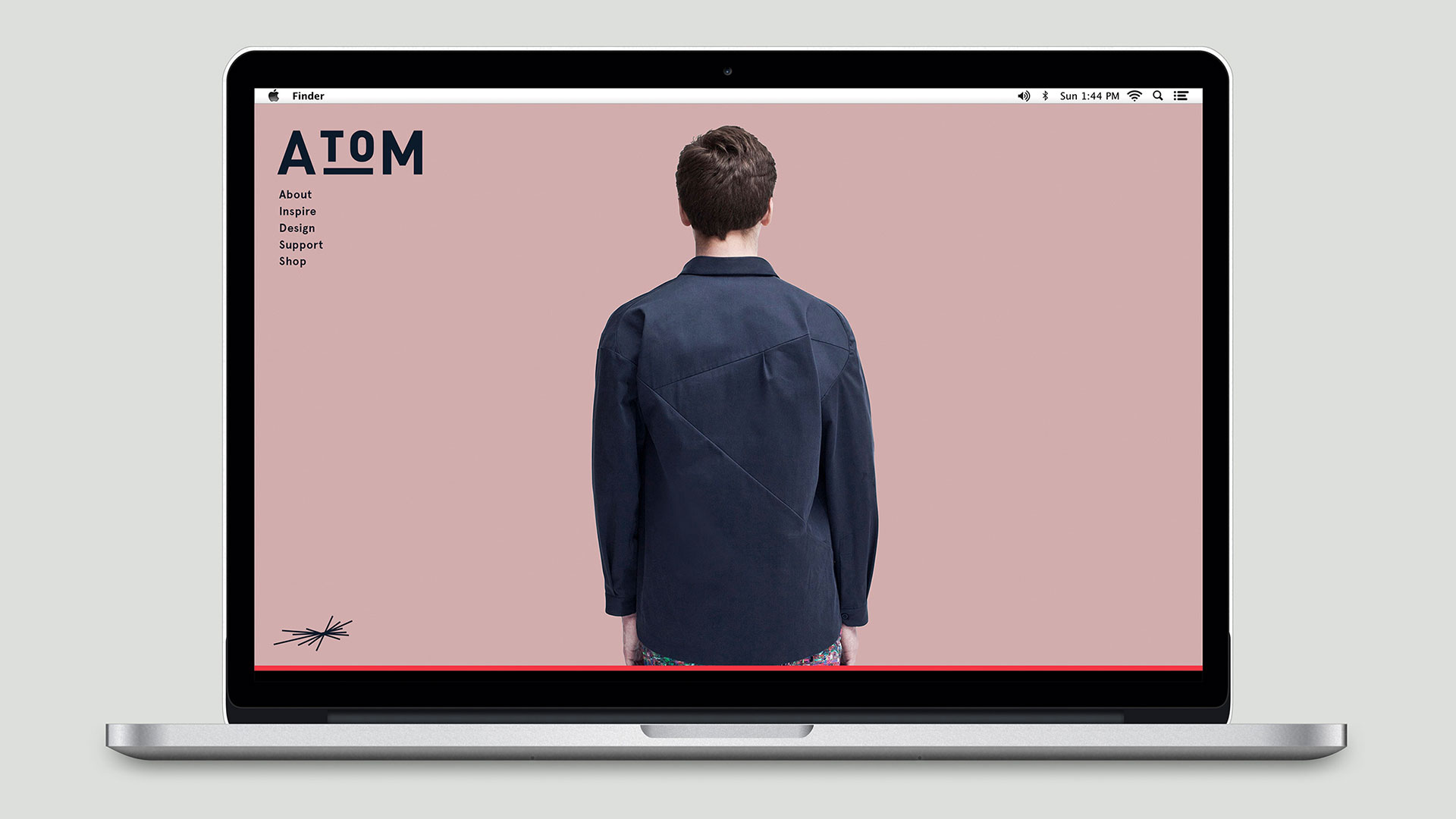
There is a deep development of stationery pieces together with graphic material for print and digital. Some graphic elements that can be highlighted are the mix of serif and sans fonts, heavy use of folios and type overlaying images.
Category: Visual Identity
Location: London, UK / Lisbon, PT
Client: AWAYTOMARS
Year: 2016