Veneno
Brand identity, website and communication for Veneno an online radio streaming 24/7 from Sao Paulo, Brazil.
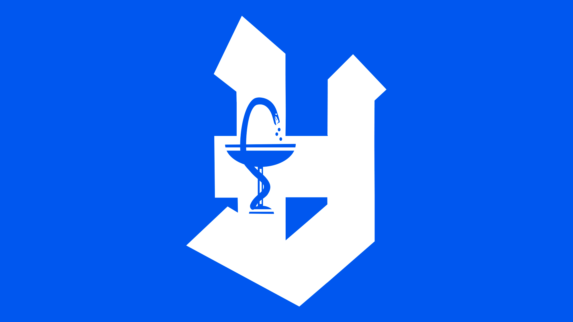
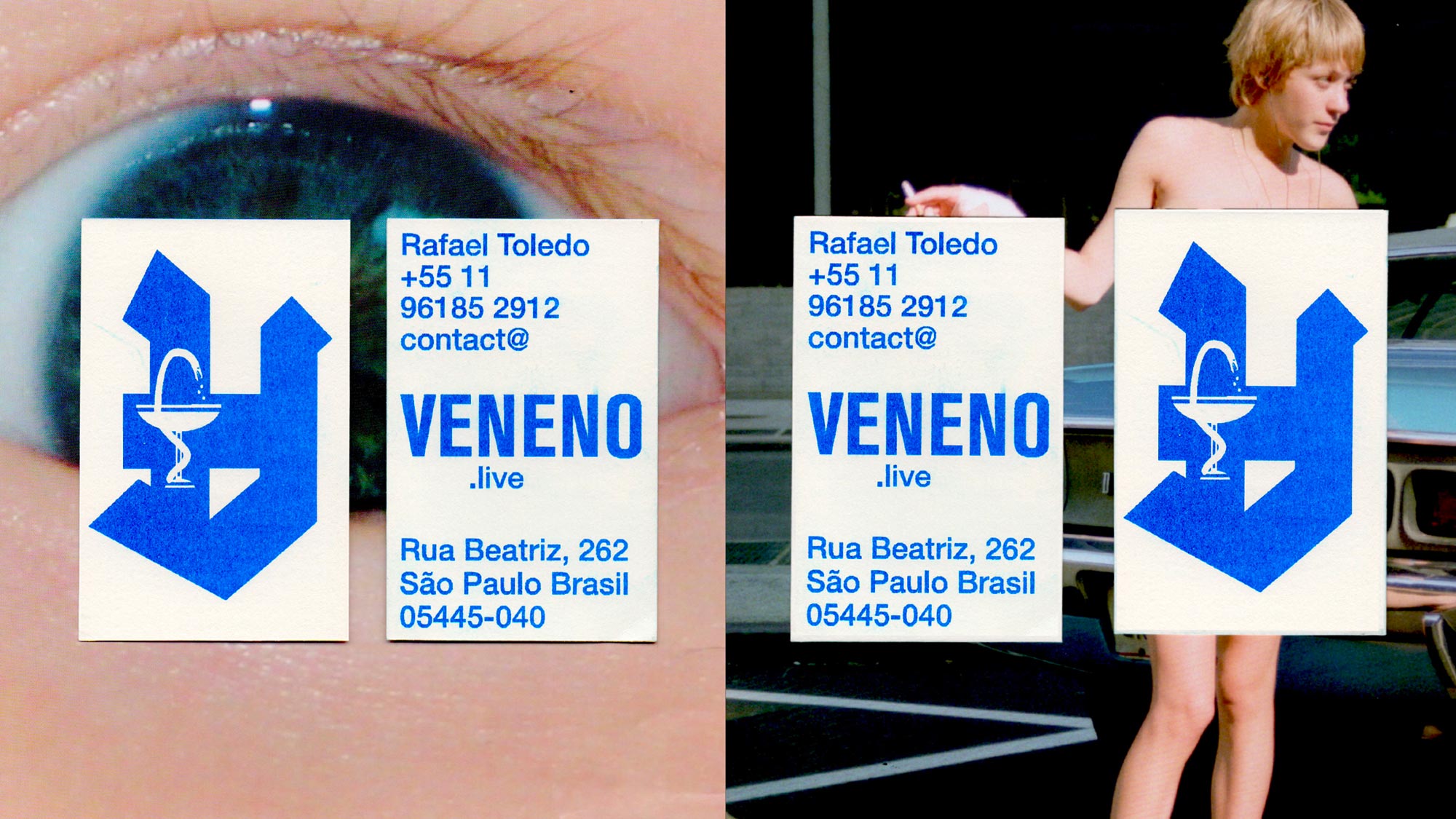
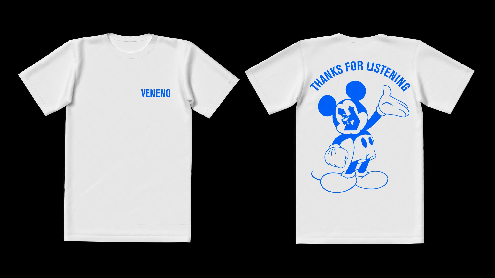
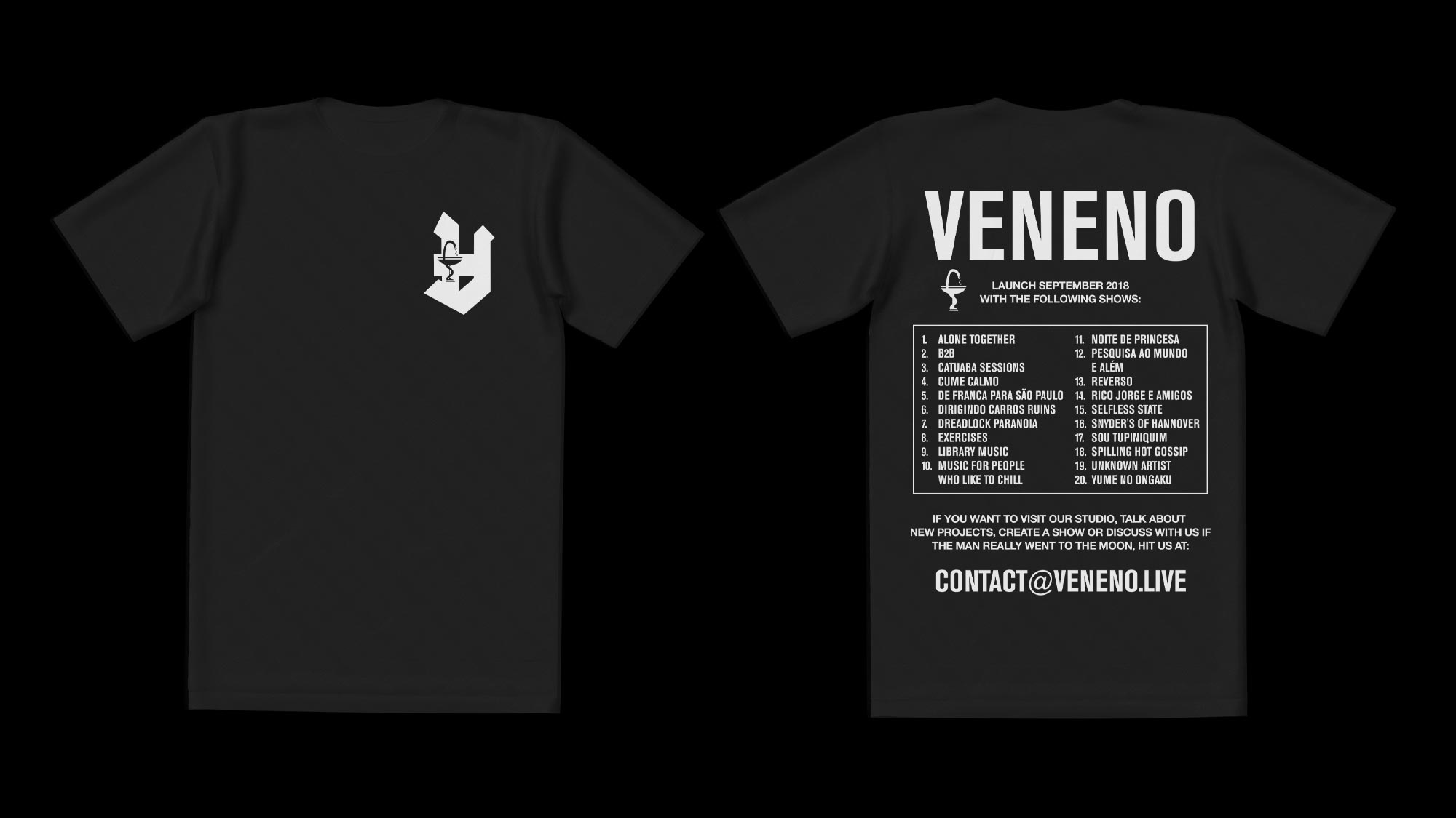
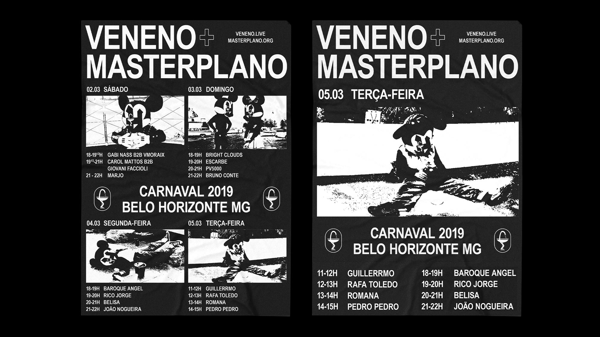
“Veneno” means poison in Portuguese and the name was taken from a holiday football team that two famous Brazilian players had it back in the 1980s when they were still active. Those players were well known for their consume of alcohol and recreative drugs. Veneno, the radio, has the purpose of aggregating, promoting and discussing music and culture in its different formats and manifestations. Though it is hard to deny the german music culture influence on Rafa Toledo, Veneno’s founder and our best friend.
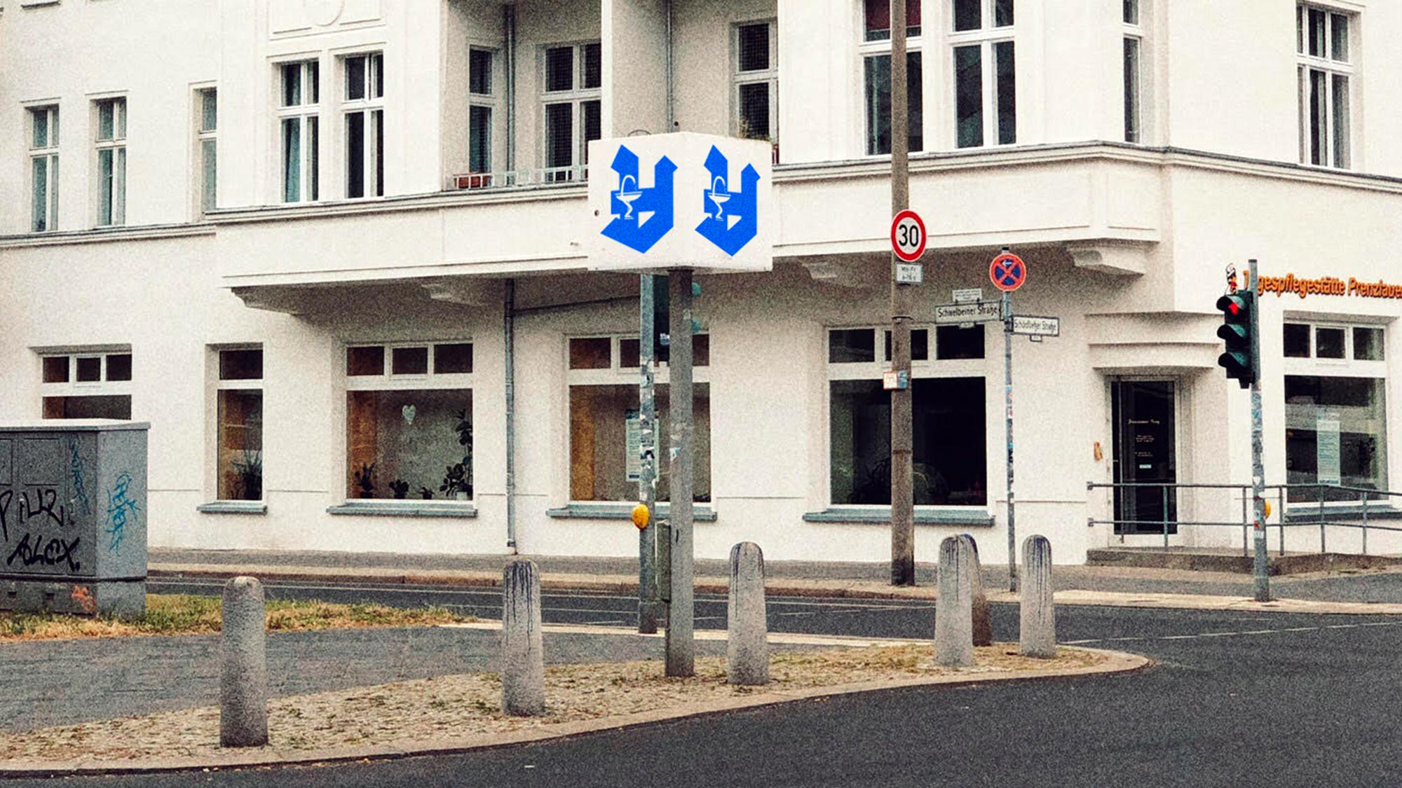
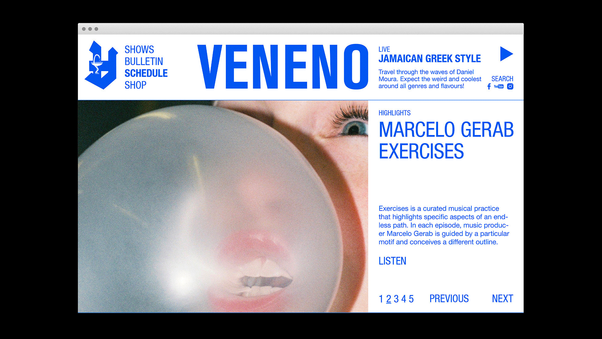
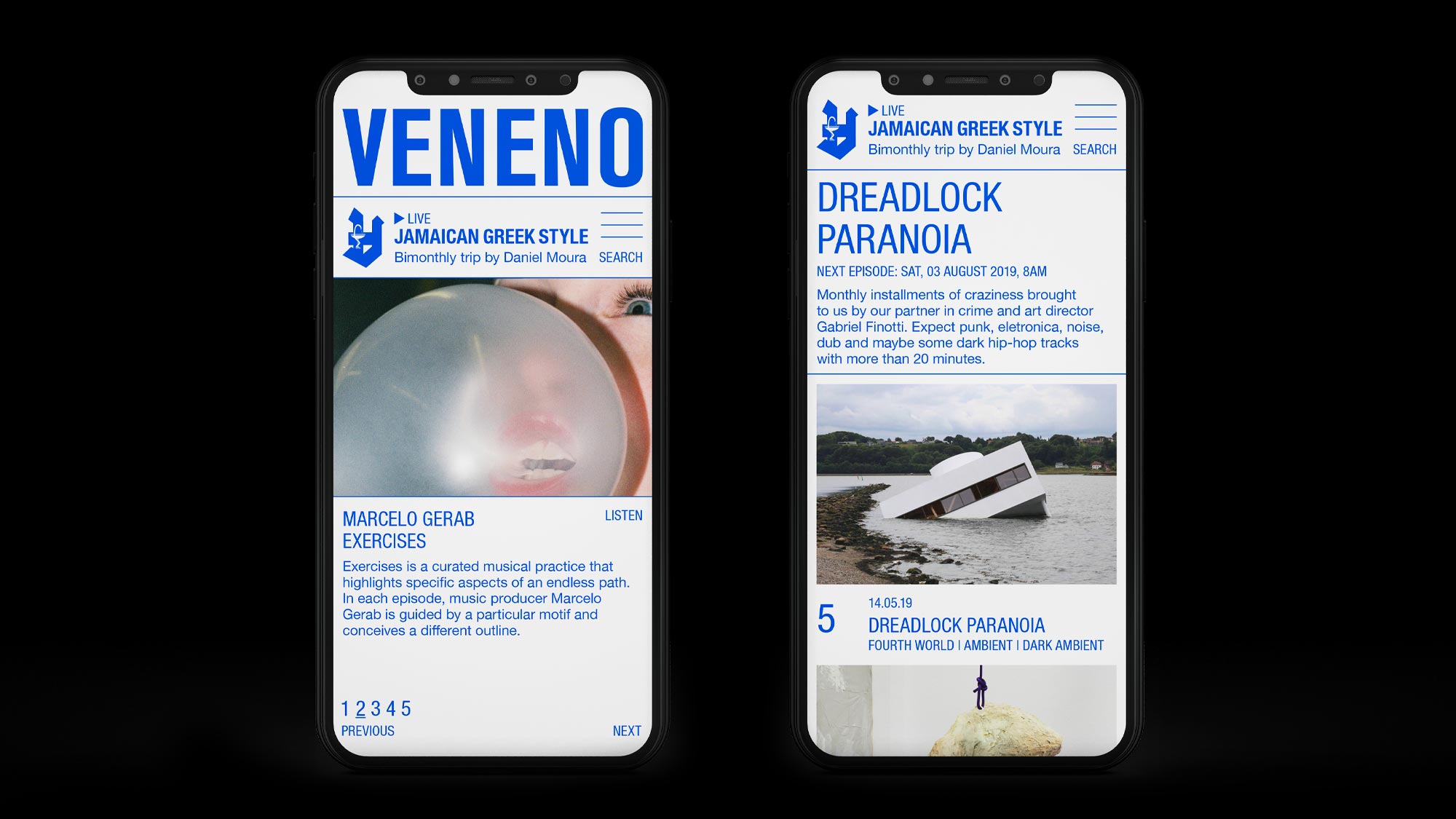
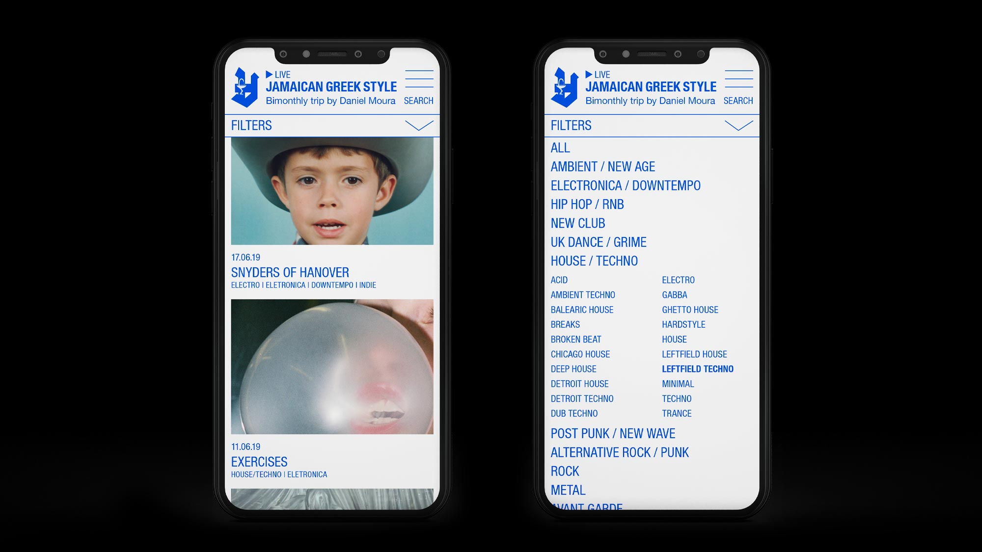
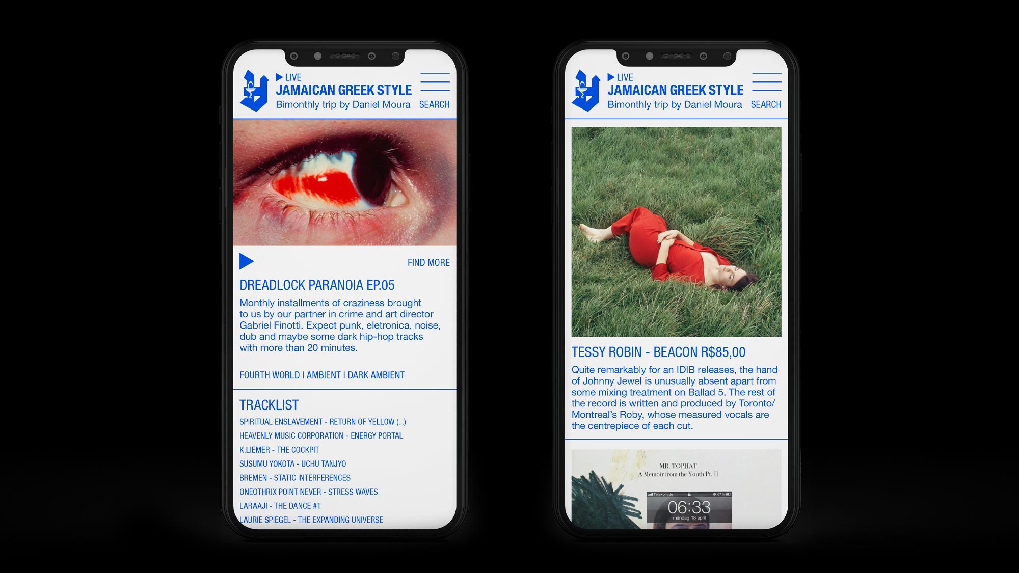
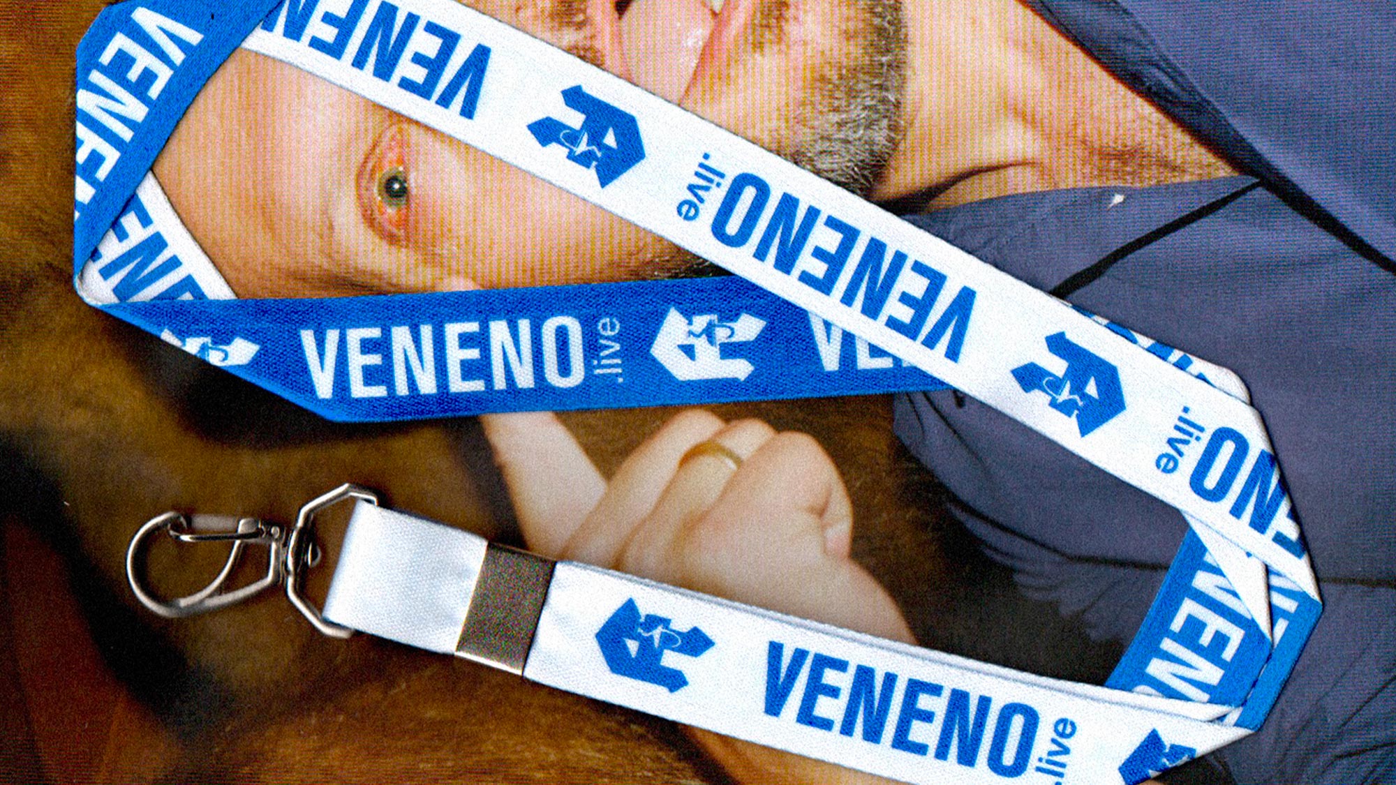
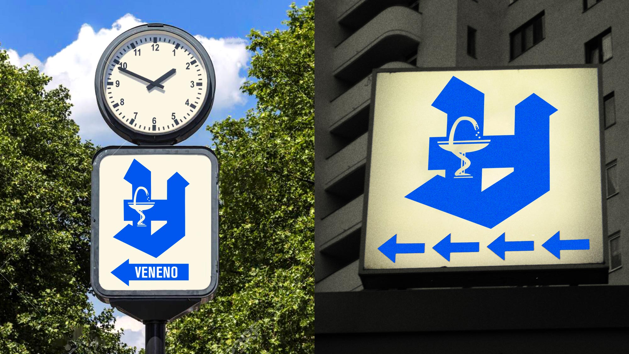
With that in mind, we developed the logo which is basically the German Apotheke logo turned upside down. It stands for drugs, for fun, for music, and fore curing. The color palette is made only out of blue and white; while the typography is composed by Helvetica only. These combinations were created in other to resemble medicine leaflets and health communication.
This project is definitely one of our favorites. We are as part of Veneno as Veneno is part of us. Please do check our monthly show, Dreadlock Paranoia, and the whole radio program which is always amazing. And thanks for listening!
Category: Visual Identity / Webdesign / Communication
Location: São Paulo, Brazil
Client: Veneno
Website: veneno.live
Year: 2018
[:pb]Cotton Project is a Brazilian coolwear brand that transites between the surf/skateboard world to the cosmopolitan contemporary life in metropolis like São Paulo. It is needless to say how much I admire the work and talent of my friend Rafael Varandas, Cotton’s founder and creative director. I’ve been following his work from close since pretty much the start of the brand, when they sold mainly t-shirts for kids that couldn’t find anything similar around. This year, Cotton Project did their debut in São Paulo Fashion Week, a huge but conscious step that positions the brand at the spotlight of the country’s market.
In parallel to that, Augusto Mariotti, my dear friend and partner at FFWMAG, had the amazing idea of building a capsule collection between FFWMAG and Cotton Project. But that couldn’t be just another merch collab, of course. Instead of just bringing the brand of the magazine itself to the products, we decided to choose three photographers that were crucial to this new phase of the magazine since its redesign. The talented Eudes de Santana, Marcelo Gomes and Hick Duarte are heavy collaborators of FFWMAG and lifetime creative friends to our history.
This couldn’t happen in a better way, for real. The magazine we love, together with the brand we love, working in a collection of photographers we love. It was a super horizontal creative process where we all managed to create together. From friends to friends.[:]