Caracol
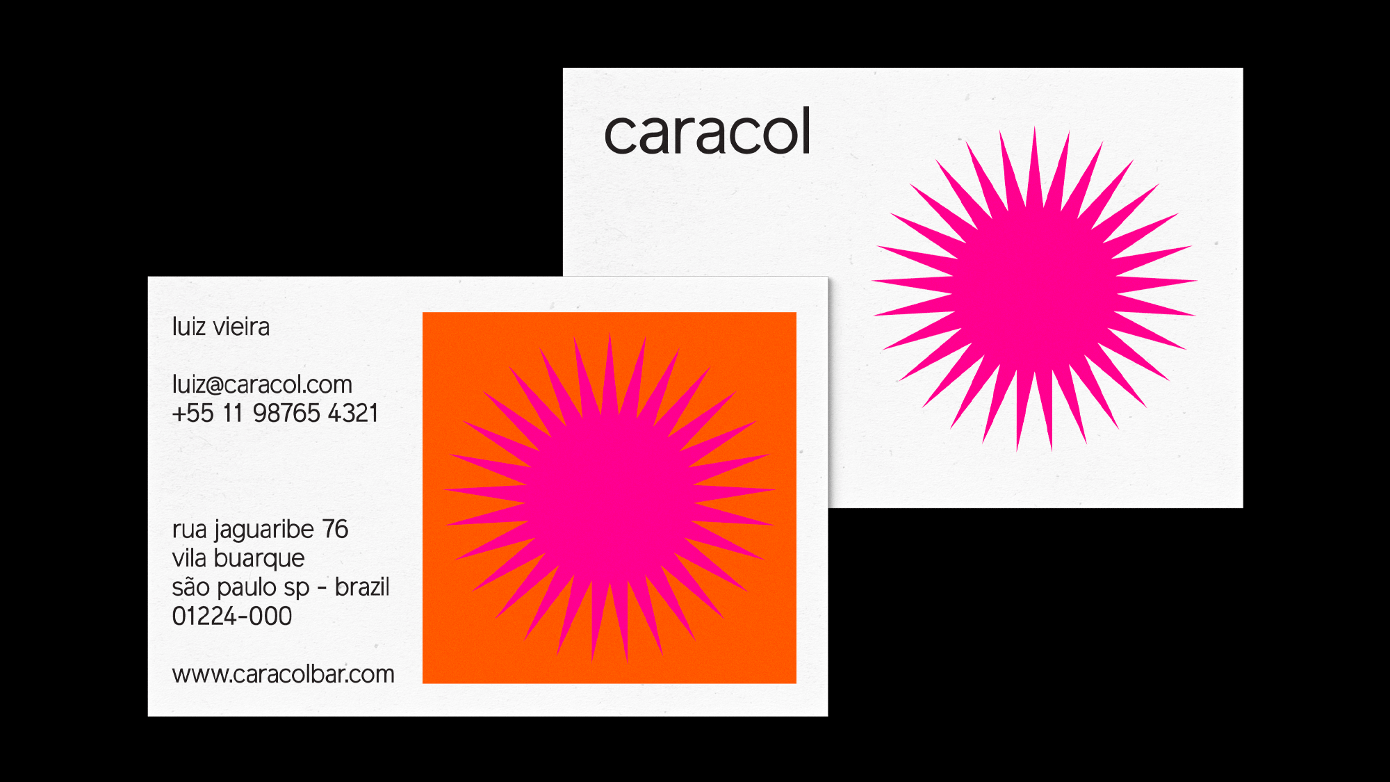
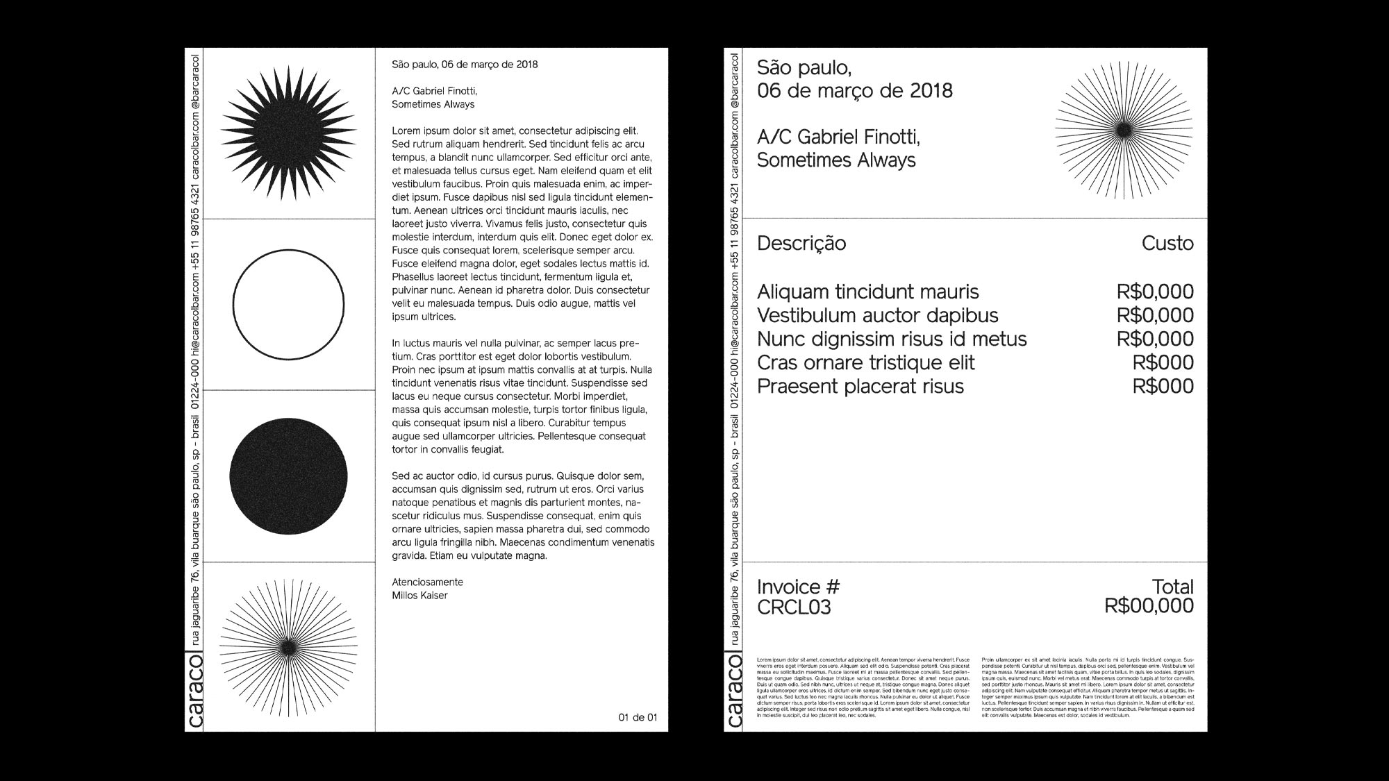

This is one of our favorite projects ever, the brand identity we designed for Caracol Bar early 2018. The reasons we love this so much are easy to name:
1. its references are modernist Brazilian graphic design (Duarte, Wöllner, and cia),
2. it is super simple and
3. it makes use of technology to create auto generative compositions.
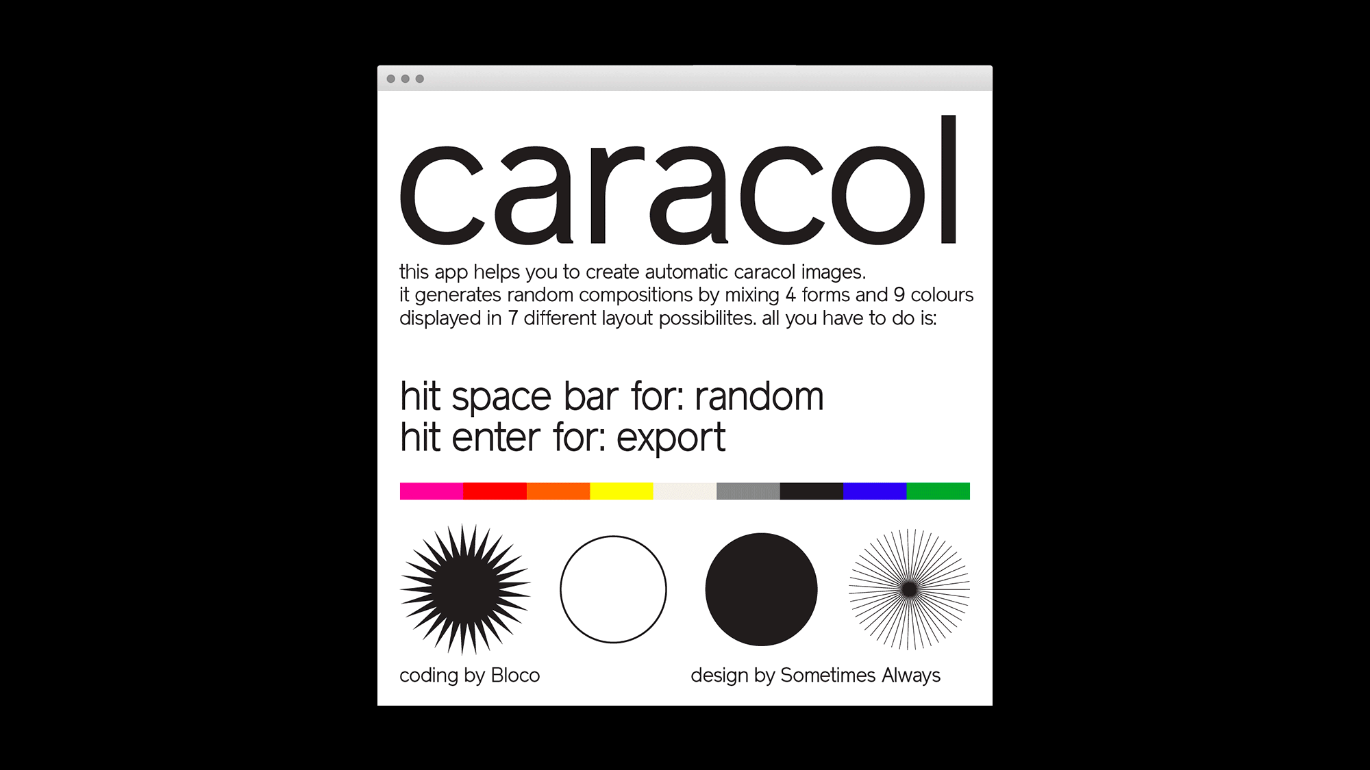
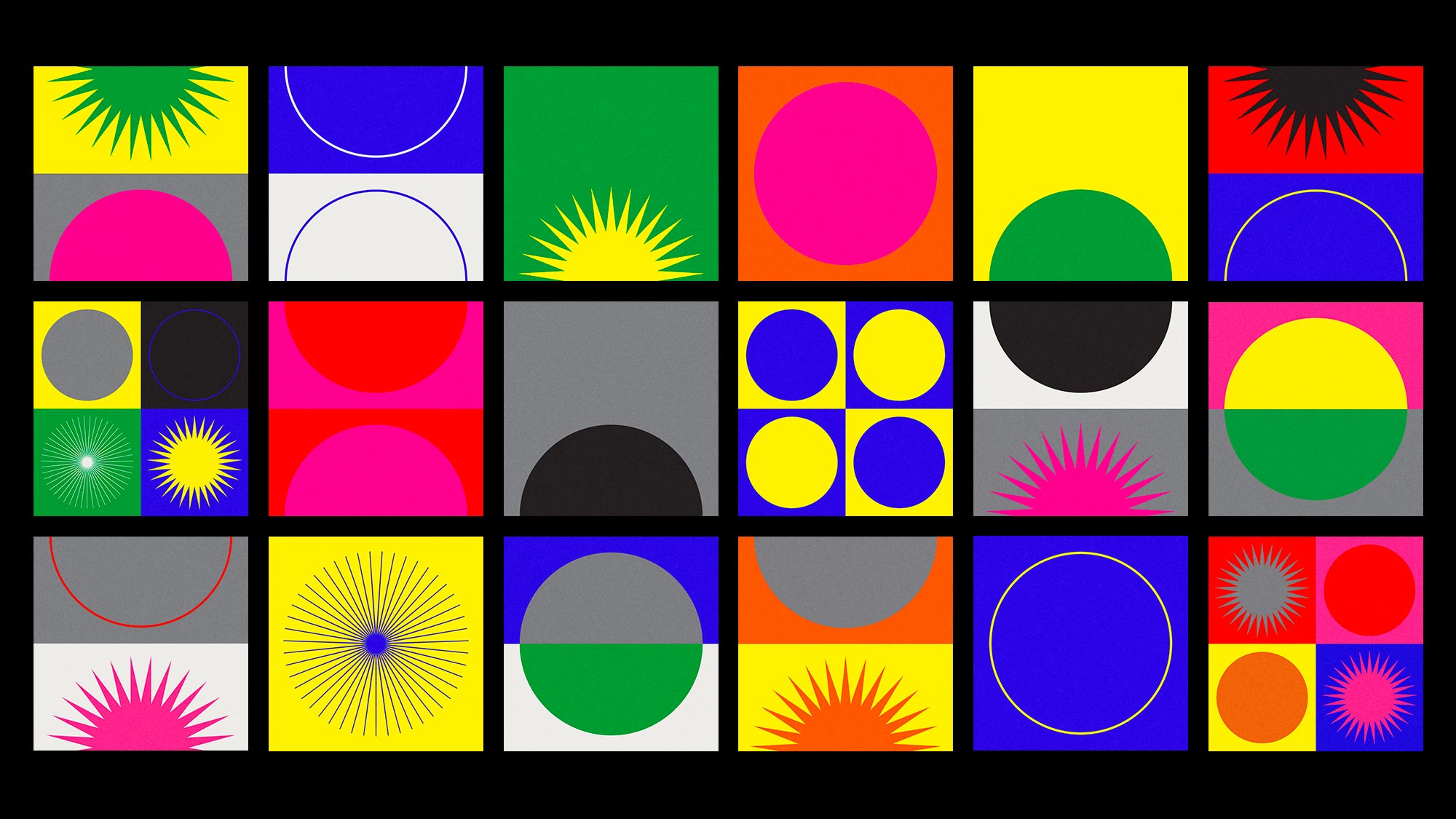
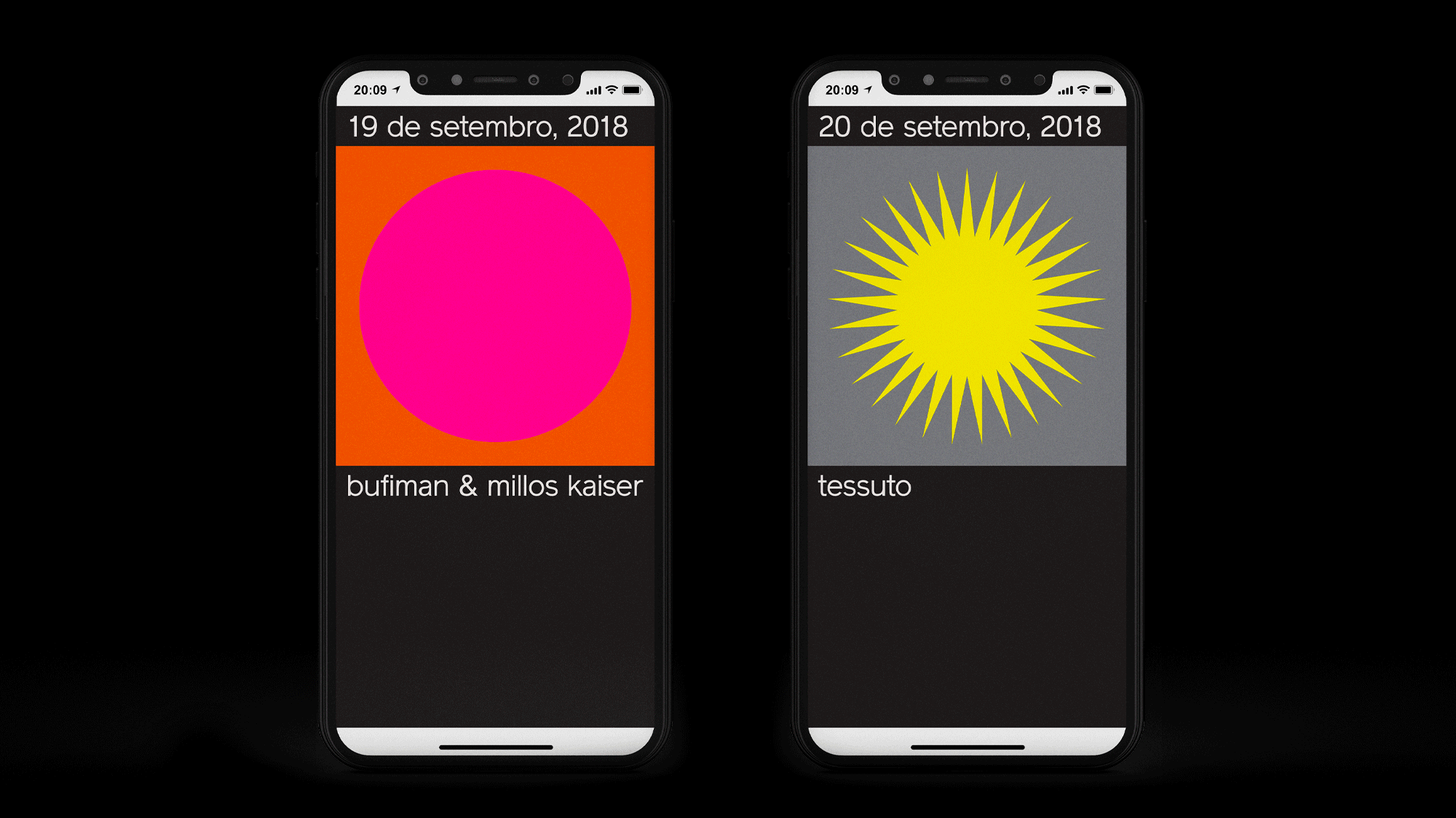
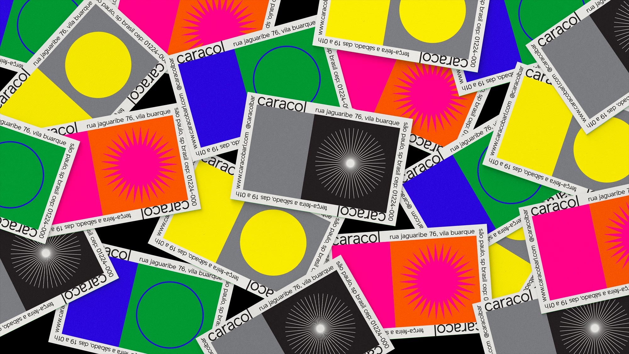
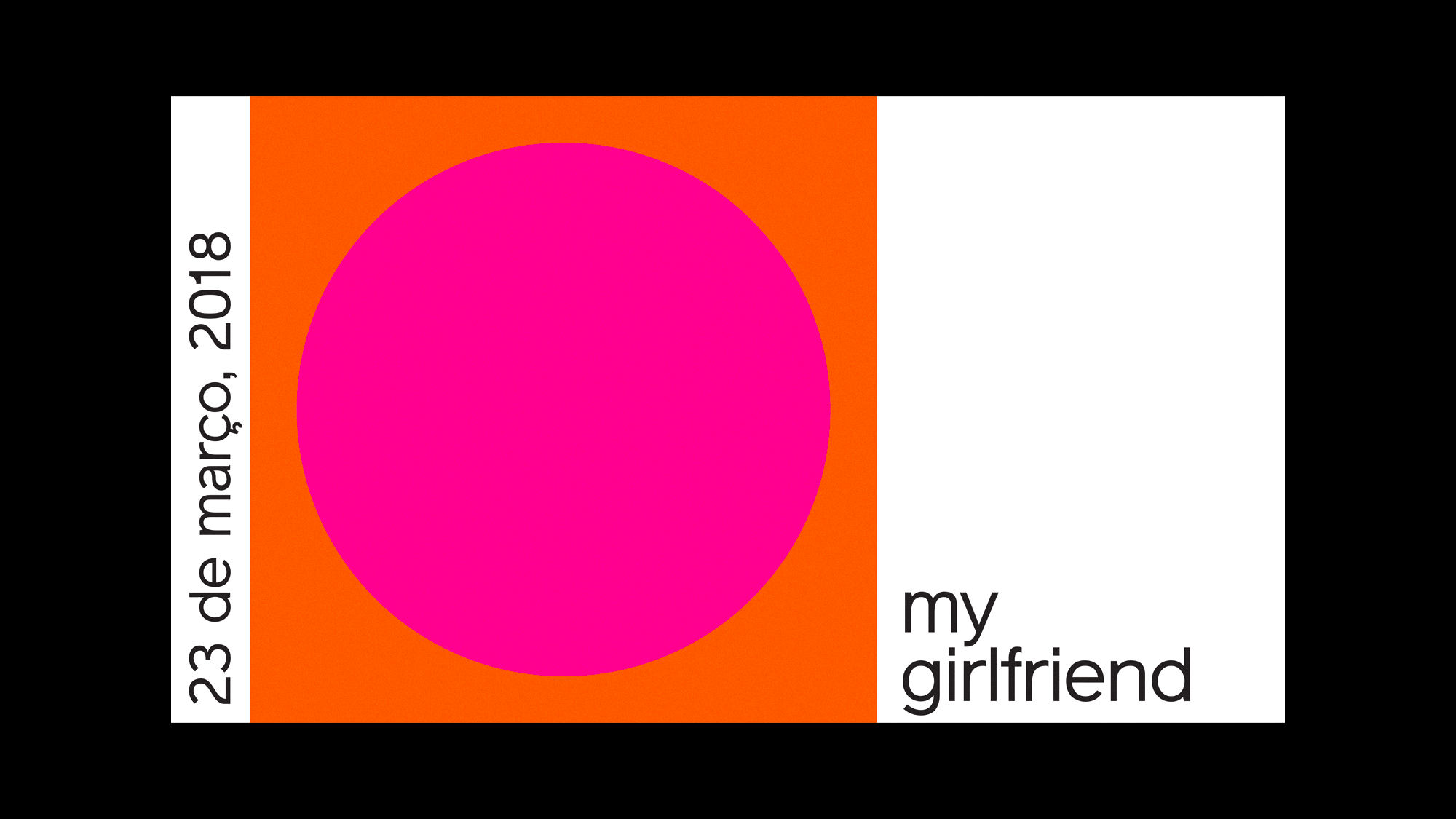
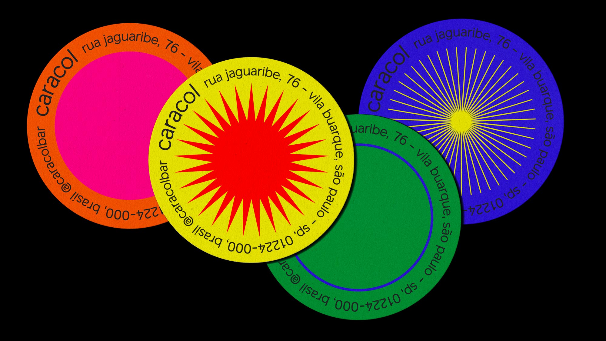
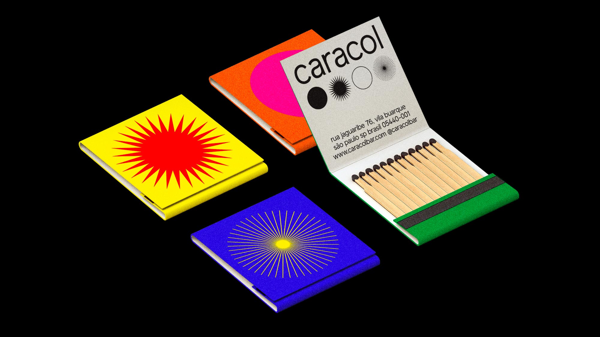
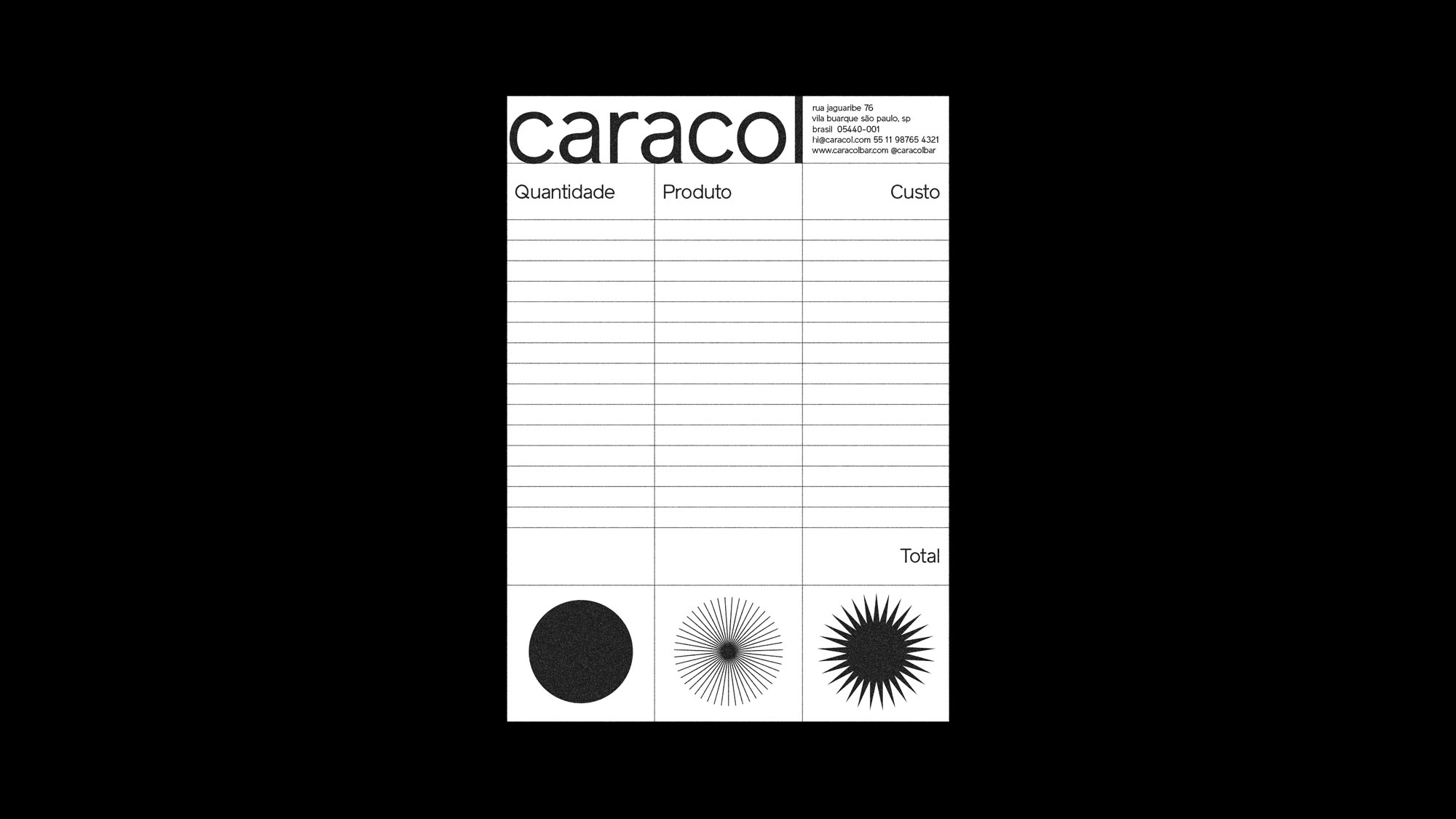
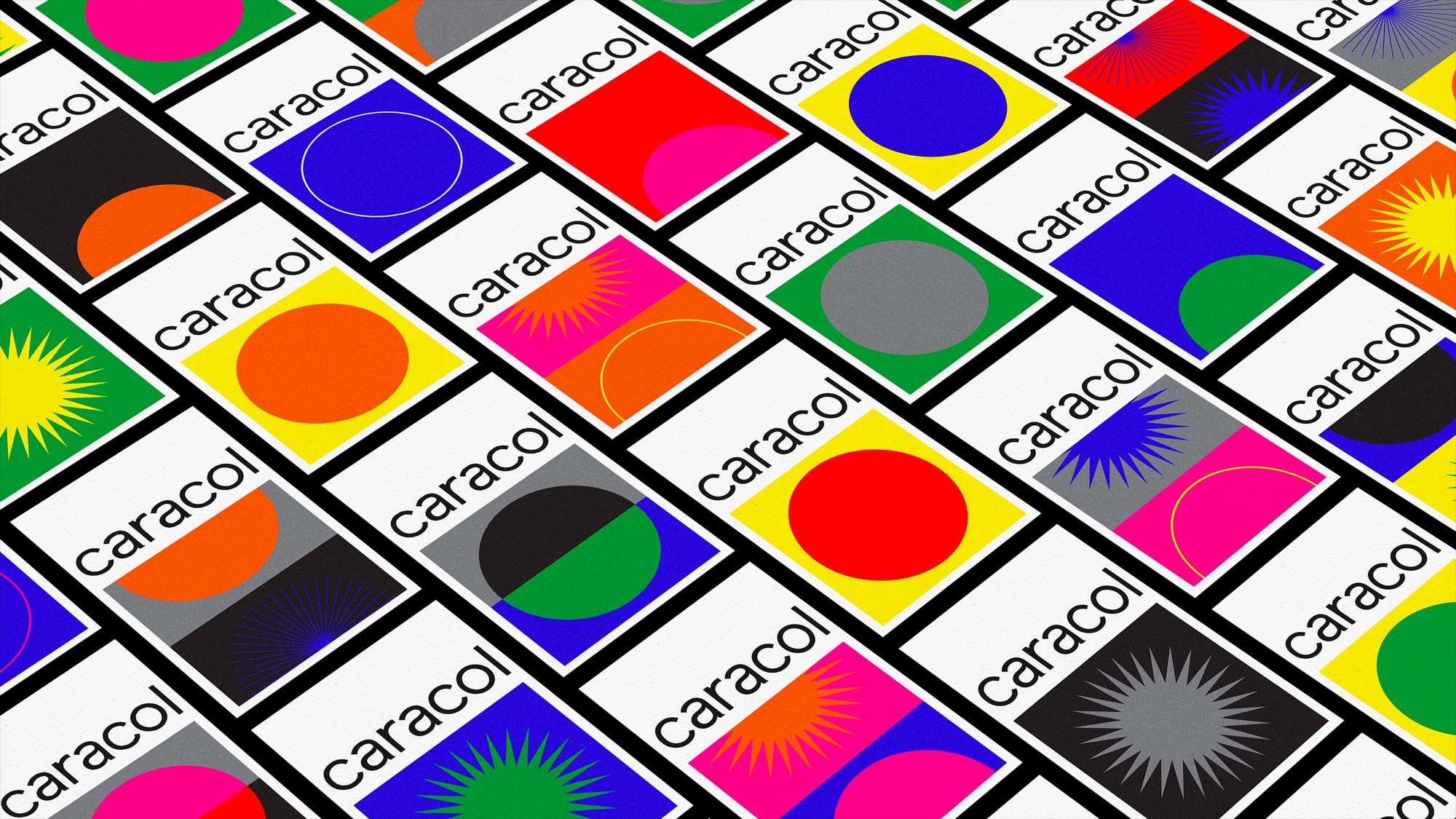
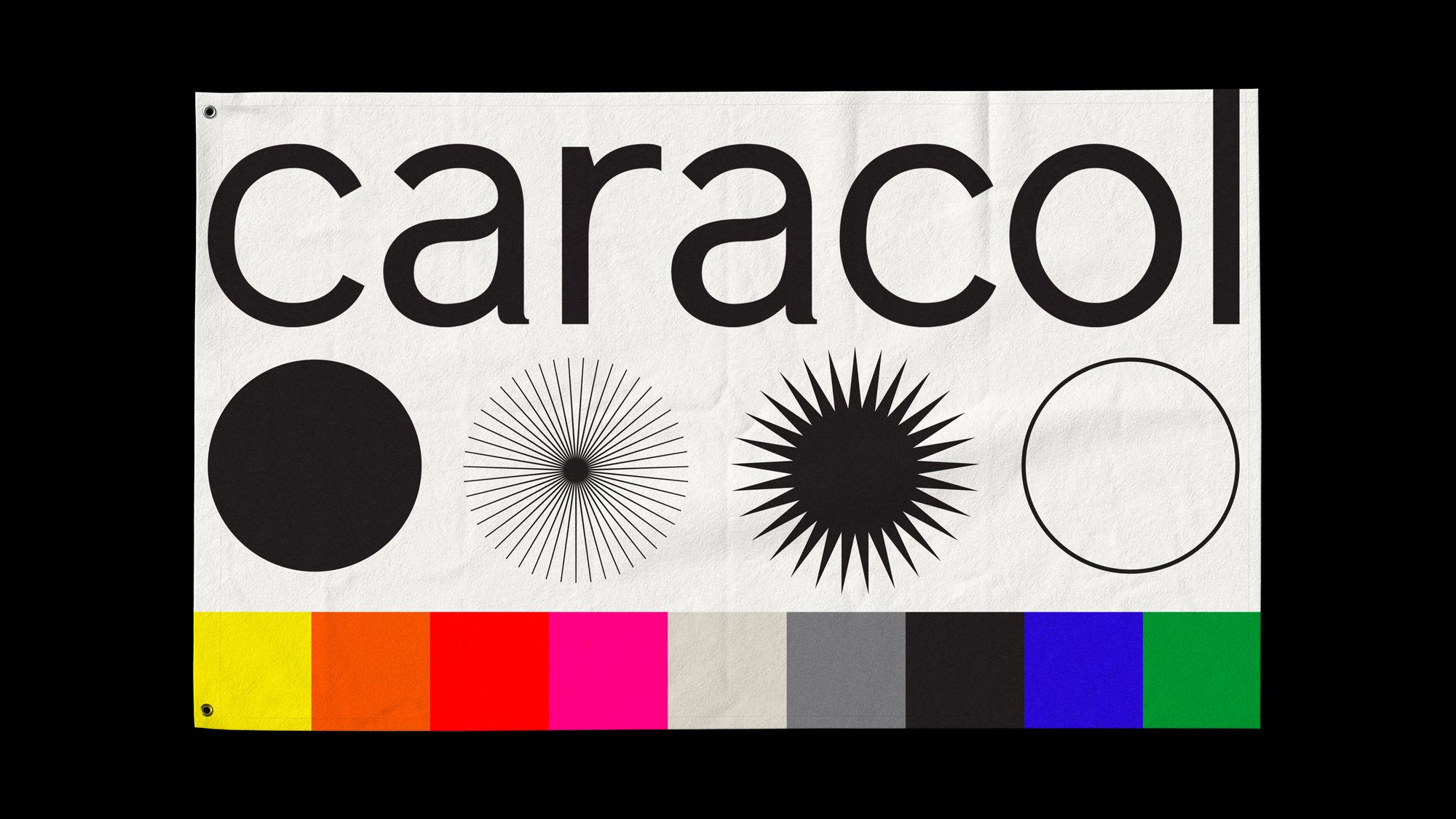
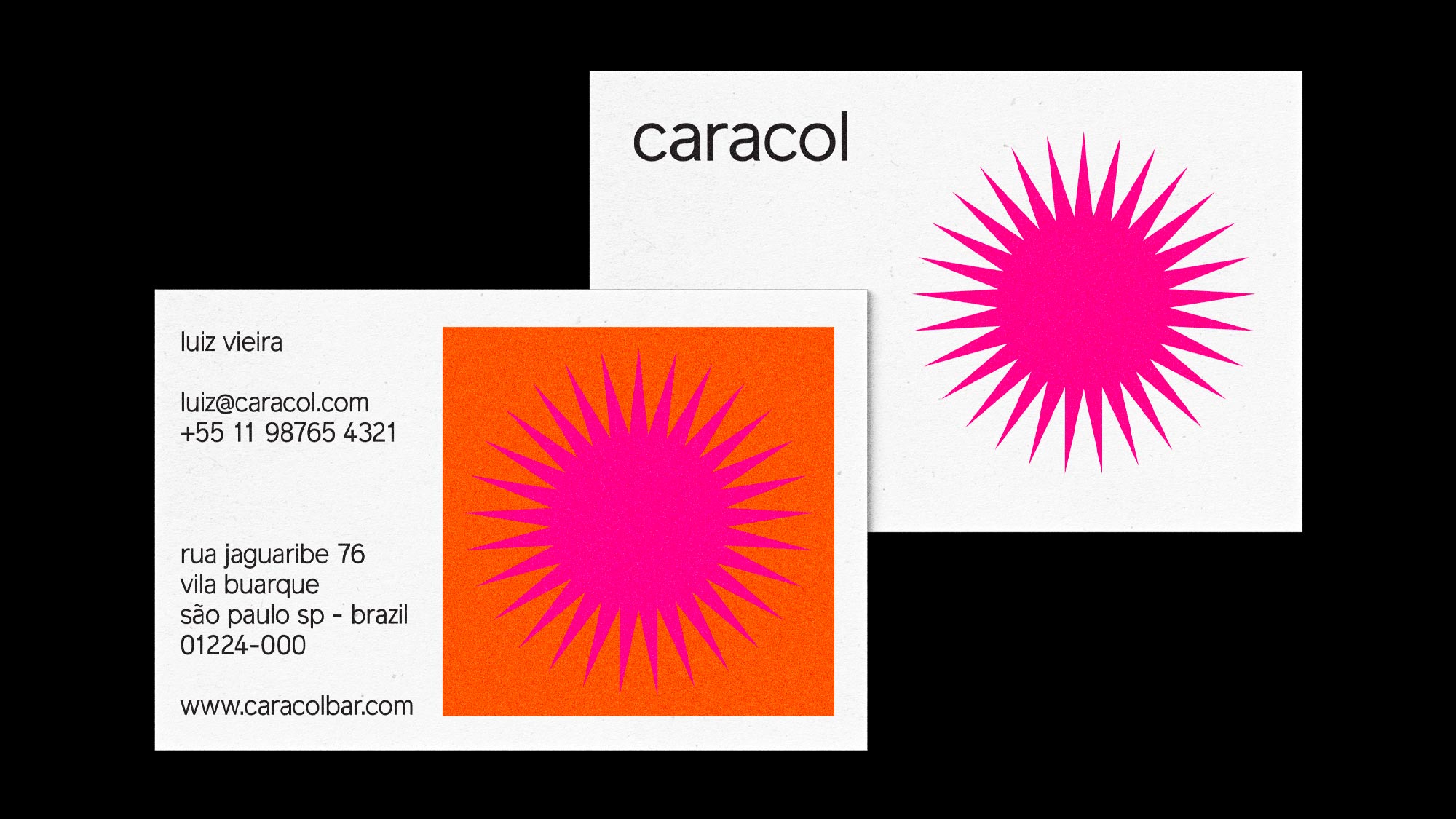
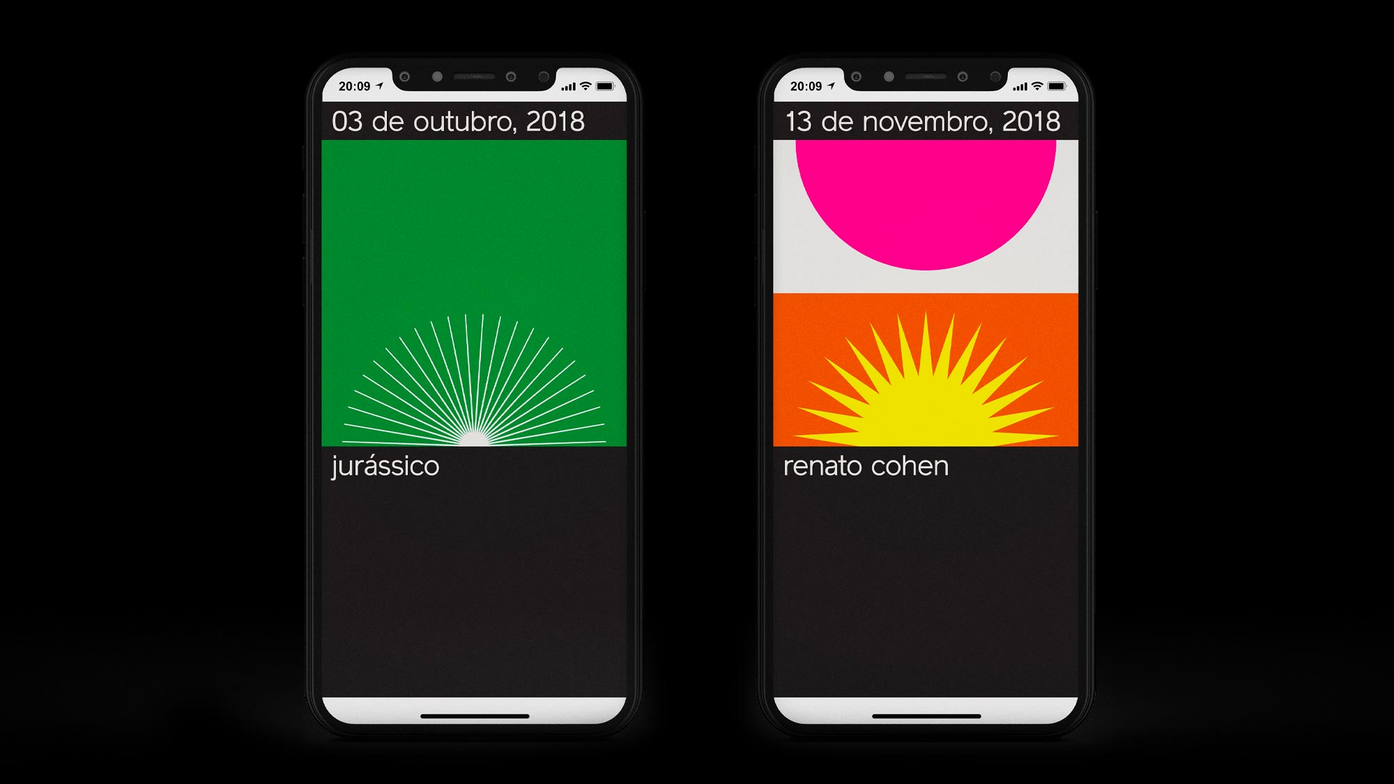
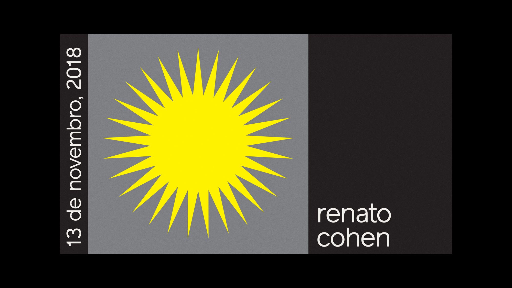
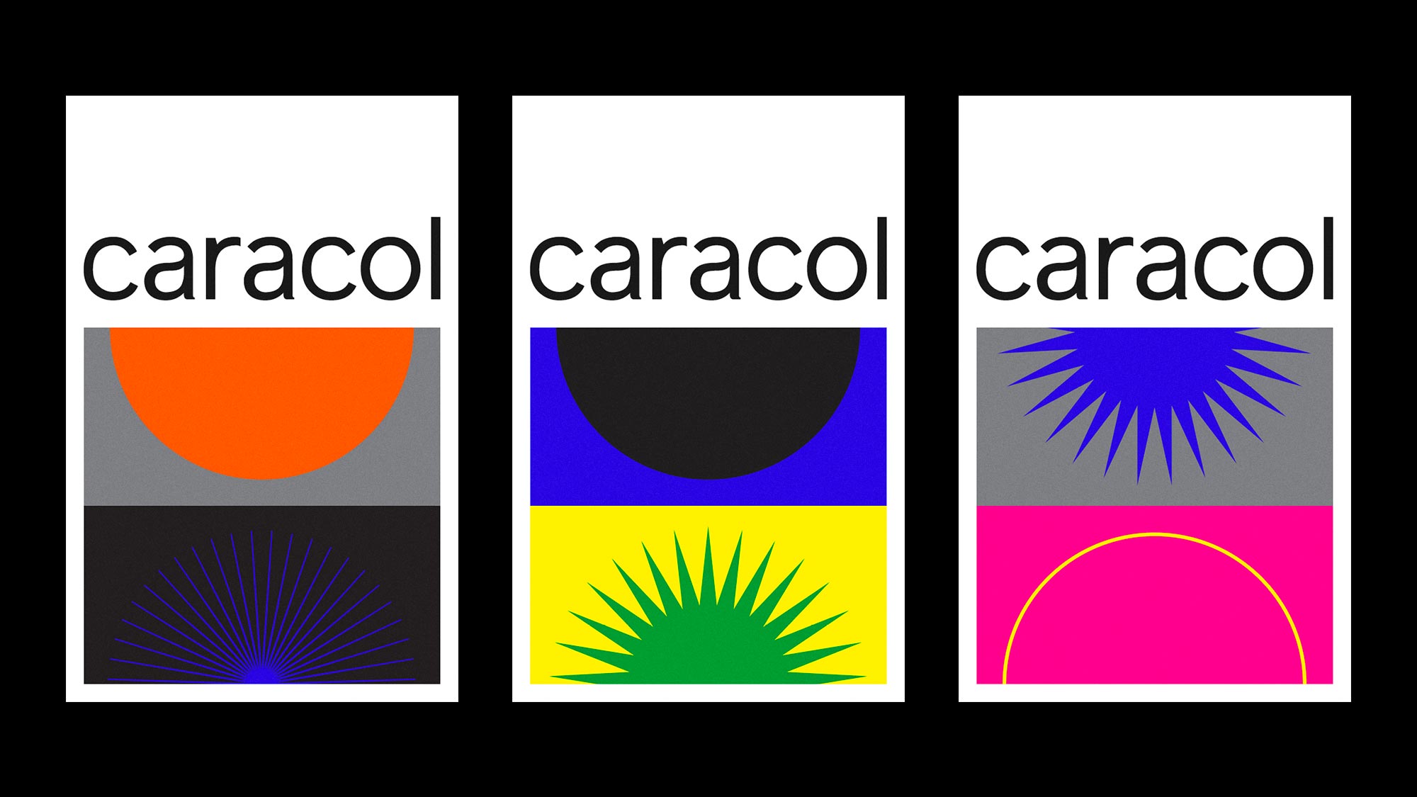
As a listening bar, Caracol has different DJs playing every day, in other words, 5 different arts every week. They needed a way to communicate themselves all this dynamic program in an easy but still attractive form. That was the challenge. Starting from scratch, we first took the basic form of the caracol (snail in portuguese) and reduced it to the minimum, a circle. Then, we created 4 different types of circles. A palette of 9 different colors was chosen and applied to the circles. Finally. we designed 7 different possibilities of layout. All these parameters combined led to an impressive number of more than 10 billion different compositions which is obviously impossible to do by any sane human. That being so, we invited the genius @bloco.studio to help us with a practical solution. They came up with an application that randomly generates the compositions within the determined parameters. All the user have to do is hit space for a new composition, and then enter to export it.
Caracol bar has been opened for almost one year now and nearly 200 different compositions have been posted on their instagram. It feels so good to see this project growing but keeping the identity so loyal to its core. If you come to Sao Paulo, please make sure to grab a drink and listen to always good music at Caracol.
Category: Visual Identity / App / Communication
Location: São Paulo, Brazil
Client: Caracol Bar
Instagram: @caracolbar
Year: 2018