Bloco
Bloco is a practice for multimedia experiences created by our good friend and ingenious mind @matheusleston Early this year we were kindly invited to design the brand’s visual identity, website, stationery and collaterals for the studio which is now alive, operating from São Paulo and acting internationally.
Bloco (meaning block or bloc, of course) combines technology and art in projects for brands and institutions. Working with light, color, space, sound, the body and beyond, the studio treats programming as a language and not just a tool. The name Bloco has multiple meanings but mostly, it represents the physicality of the projects done by the studio, the diversity of talents involved in every project and the solidity of Leston’s outstanding body of work.
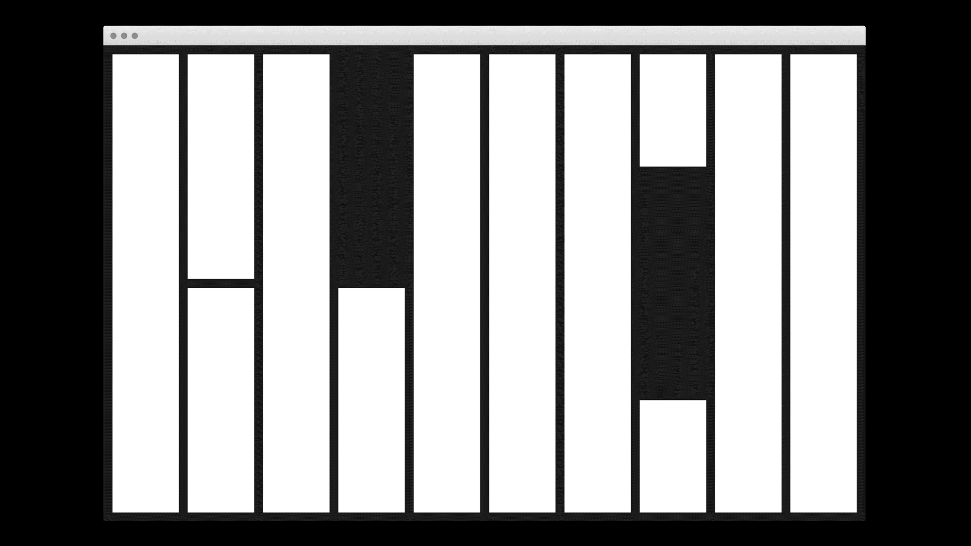
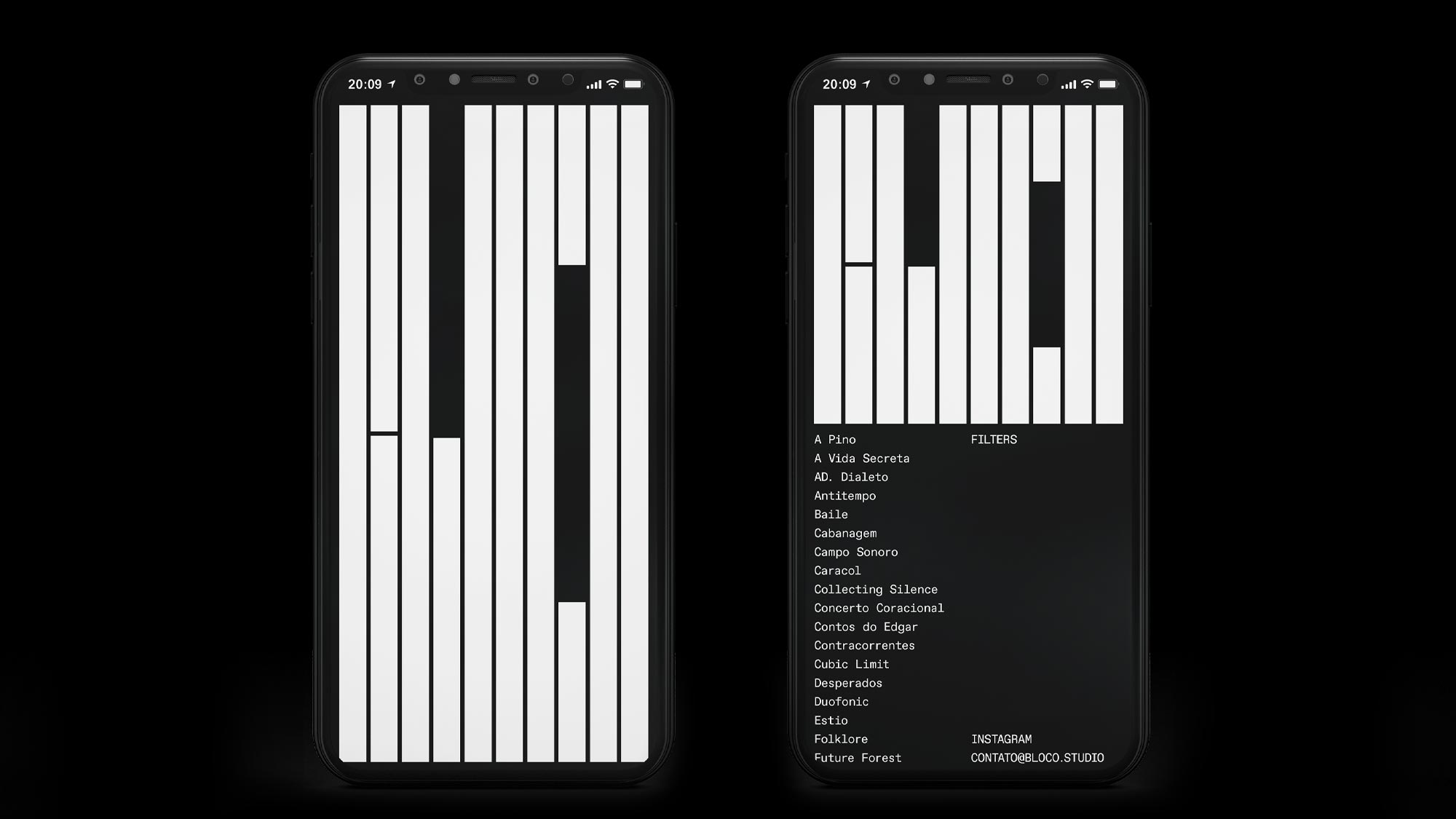
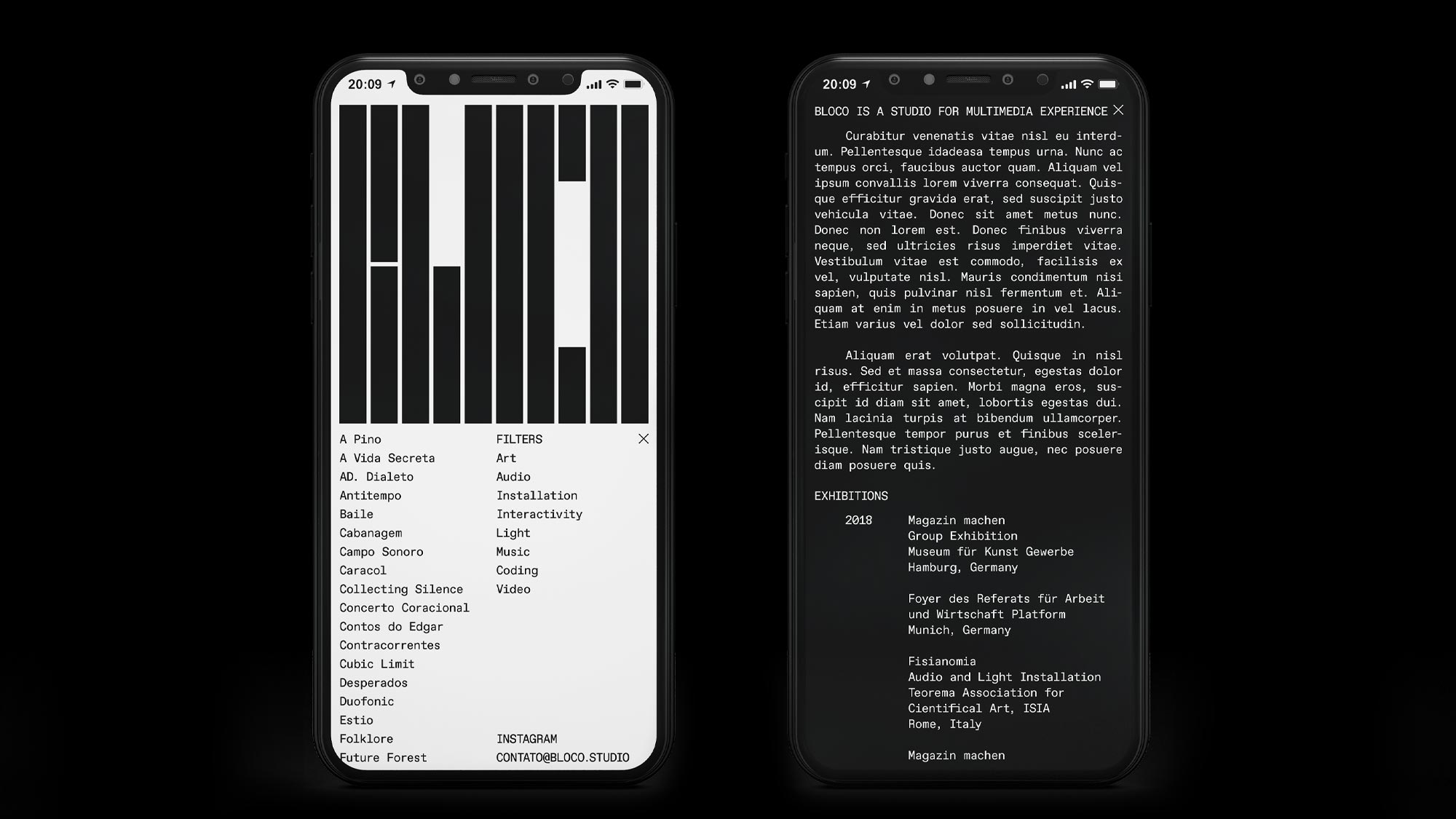
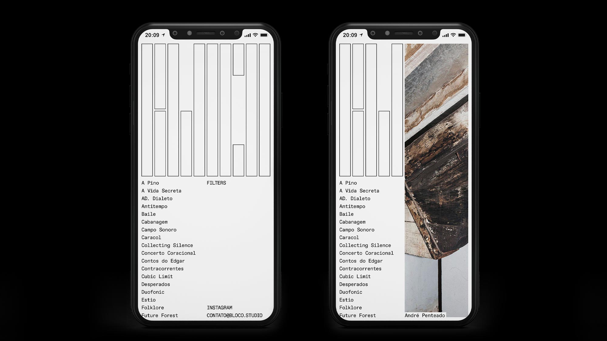
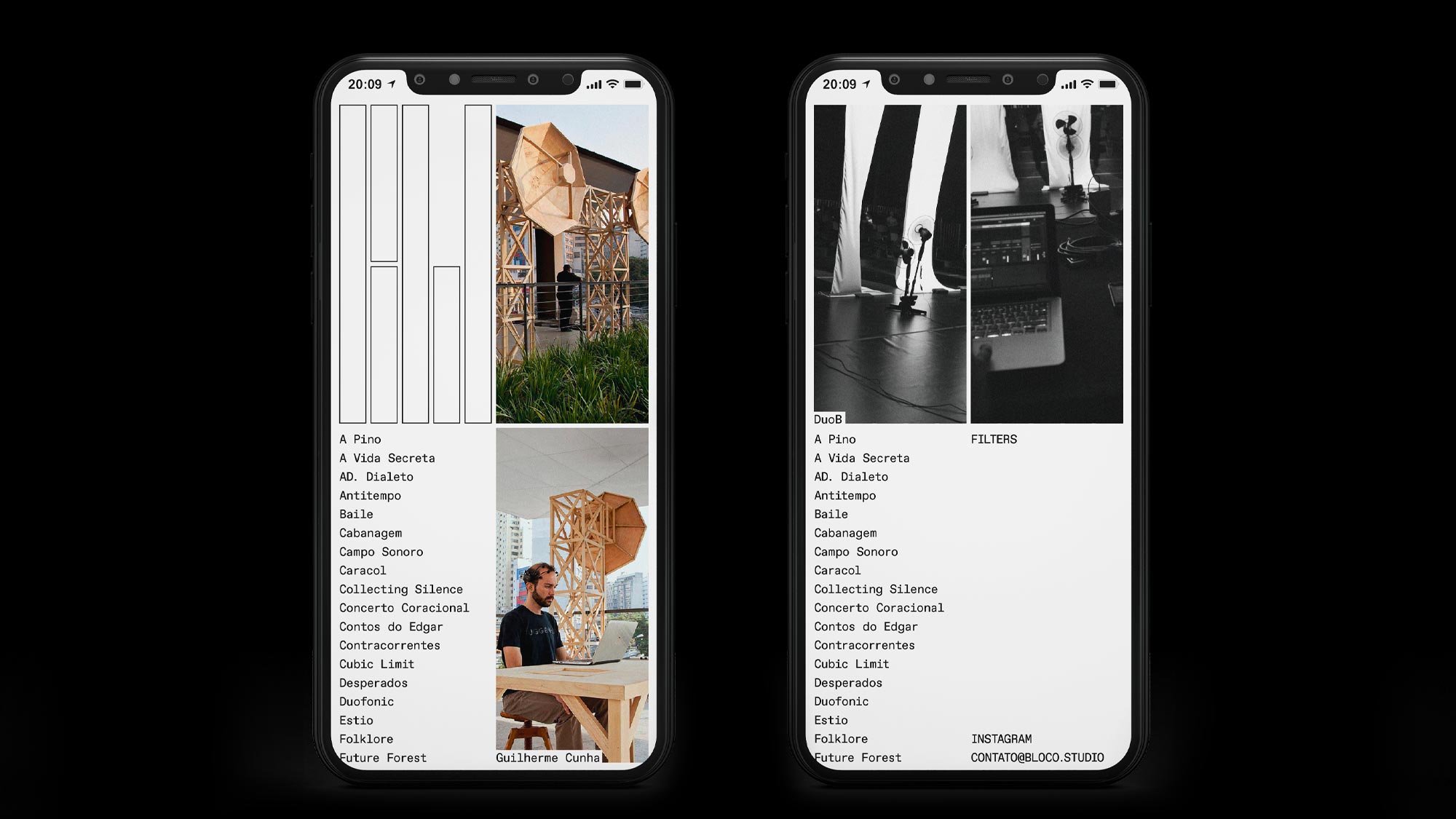
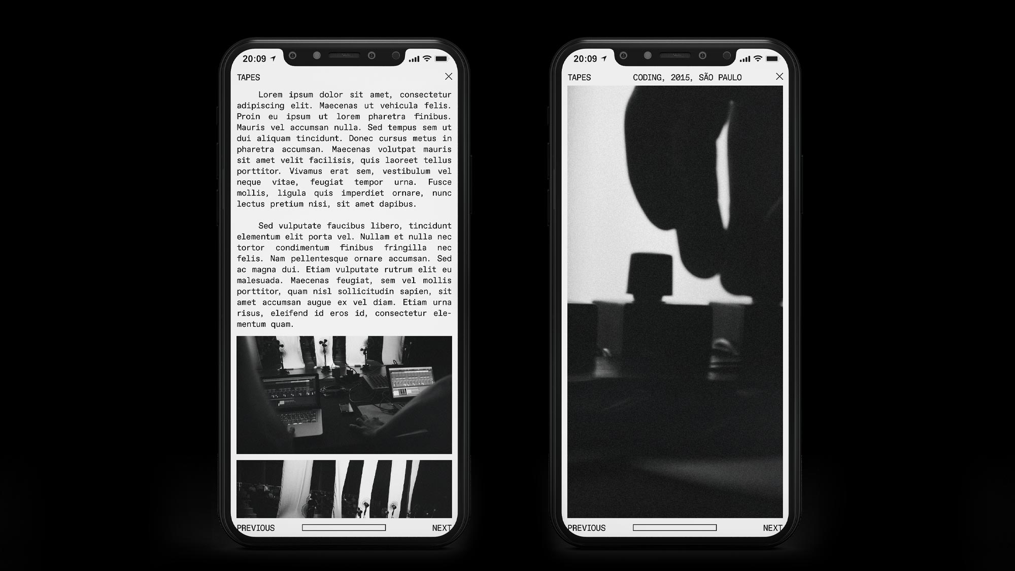
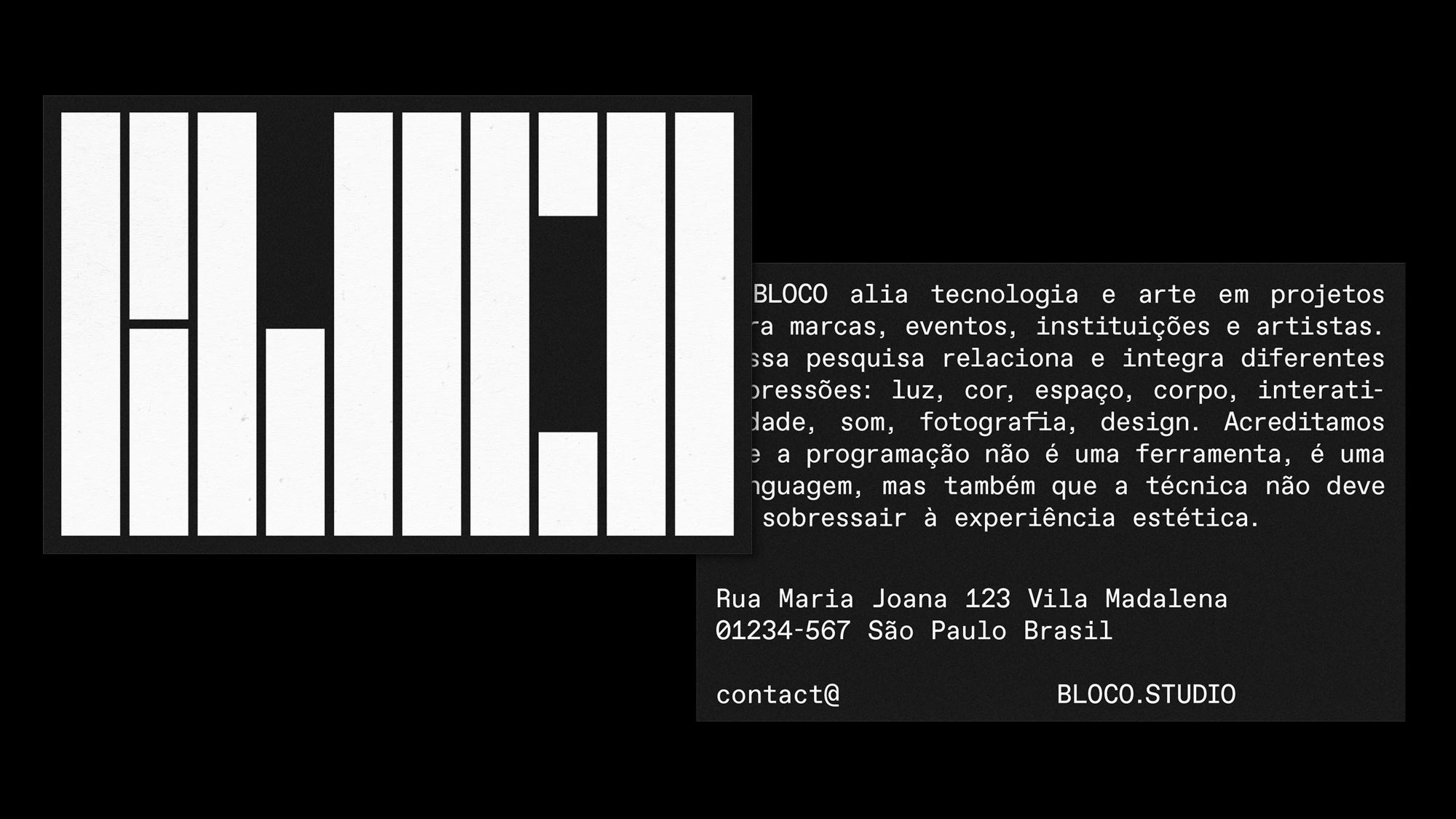
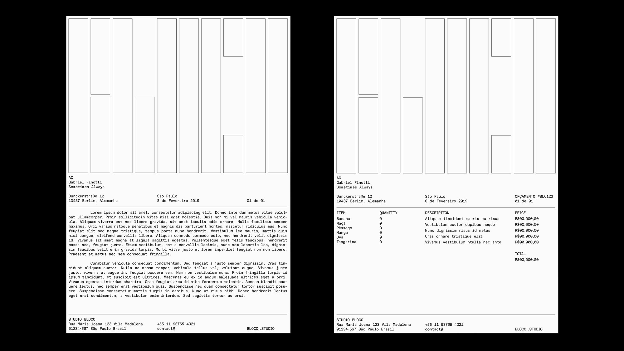
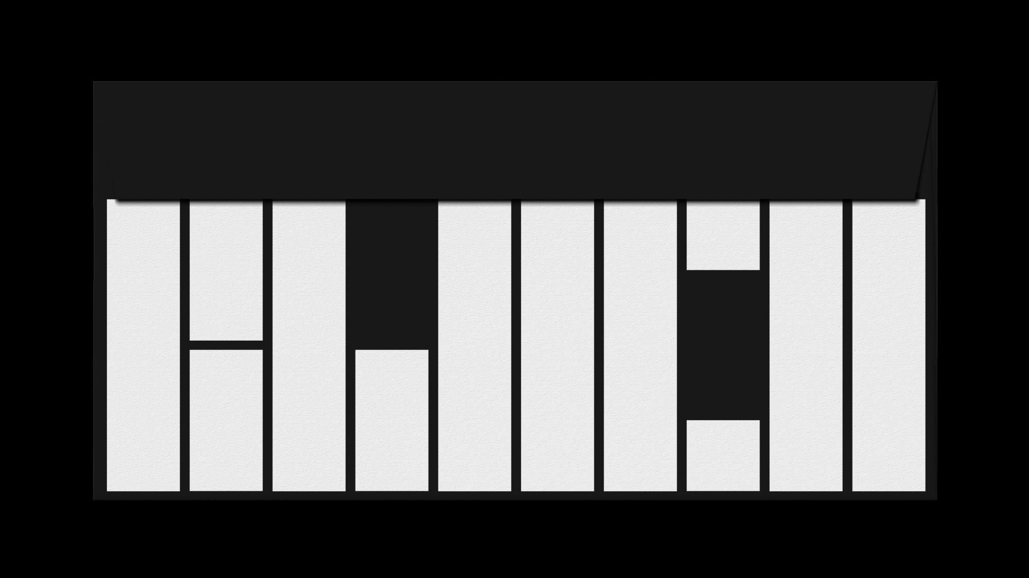
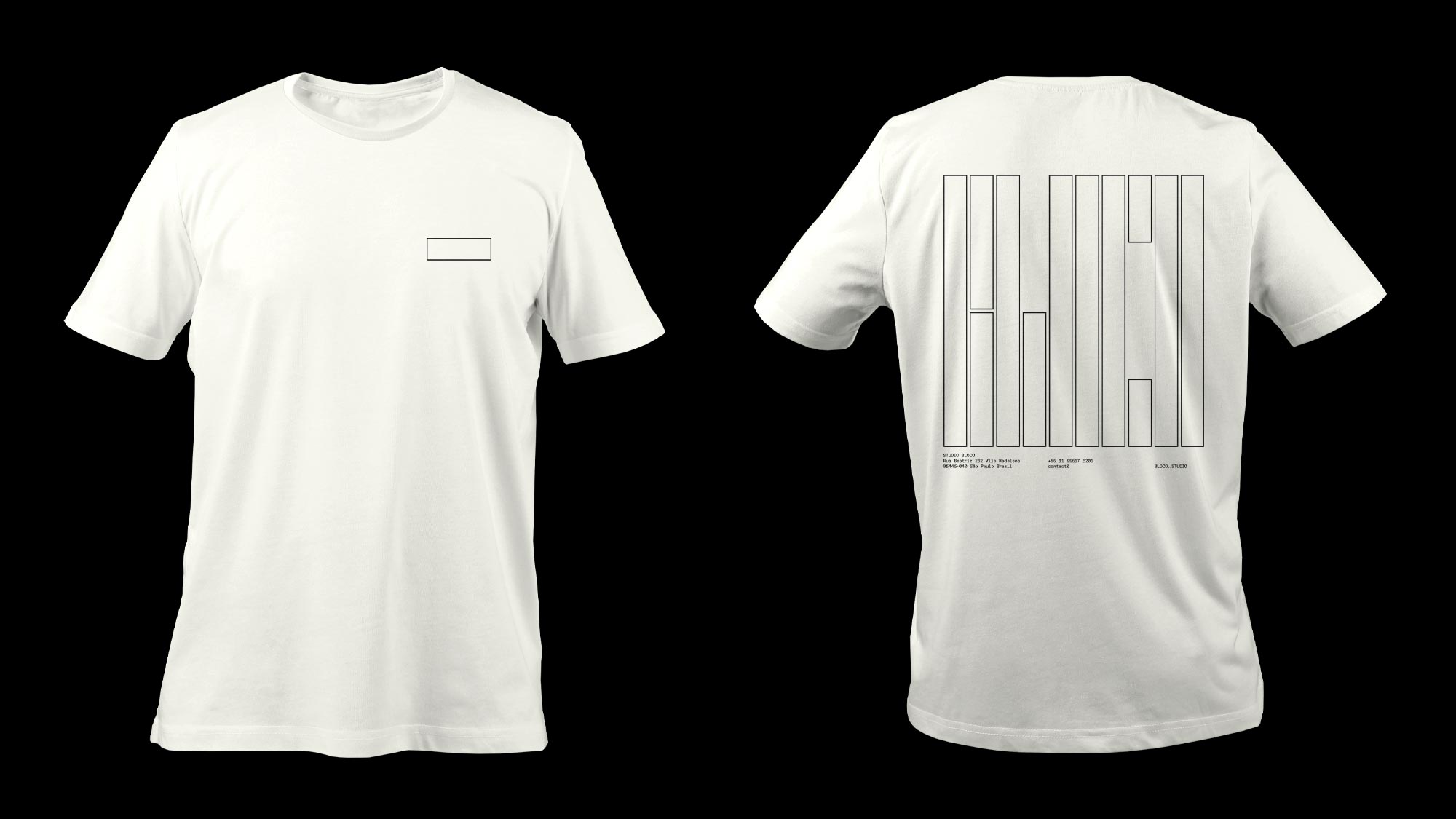
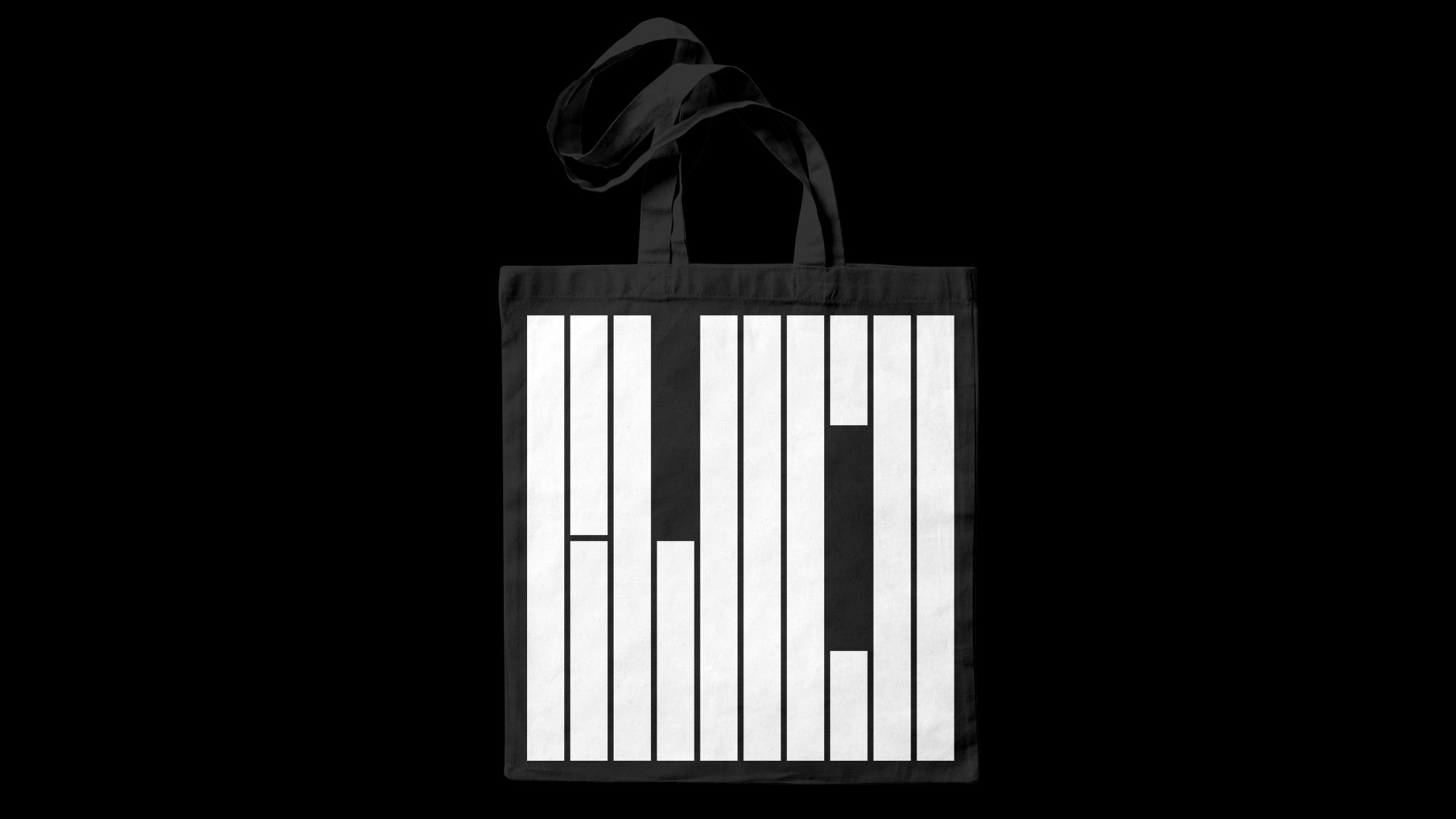
With that in mind, the logo was designed using a 10 columns grid that is limitless in height, meaning these 10 columns can grow as much as it is needed in height and we still are able to read BLOCO. This adaptability of the logo was putted into action in digital material such as the website, for instance. A monospaced typography was chosen to support the rigid constructive grid but also, to resemble the coding and programming softwares, one of Bloco’s main activities.
Category: Visual Identity / Webdesign
Location: São Paulo, Brazil
Client: Bloco
Website: bloco.studio
Coding: Fluxo
Year: 2019