Beck’s Packs


The German beer Beck’s entered the Brazilian market in the year of 2019. Owned by Ambev group, the beer arrived in the country with a very basic ID, communication and packaging guideline. Under the direction of Rodrigo Peirão, Beck’s went under a complete rebranding process that involved multiple agencies and studios. The core elements of the brand such as logomark and icons remained as they were before but a whole new set of typeface, color palette and design system were redefined by this handful of creatives.
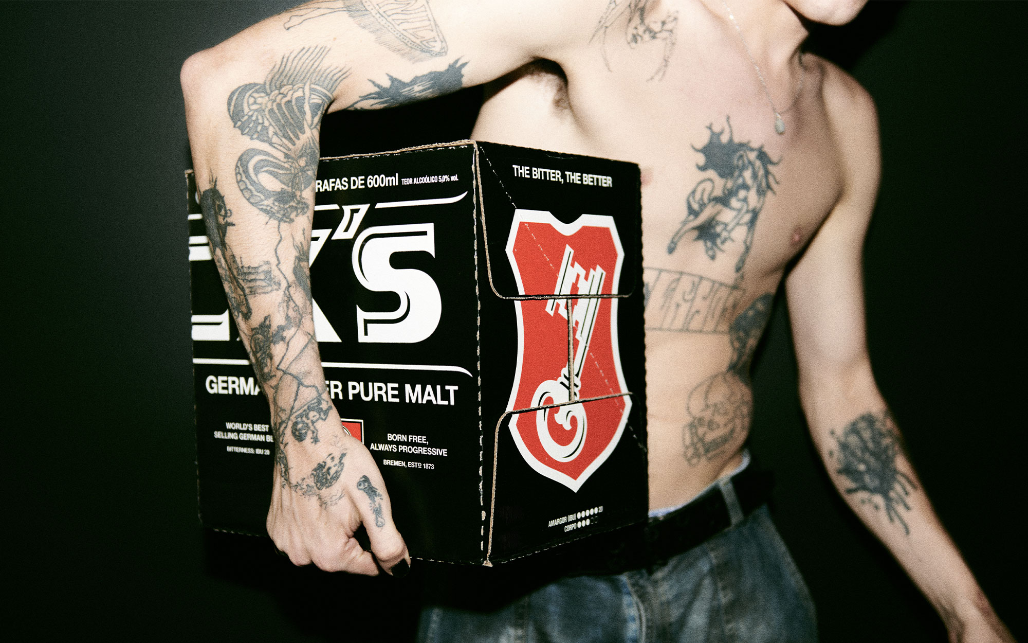
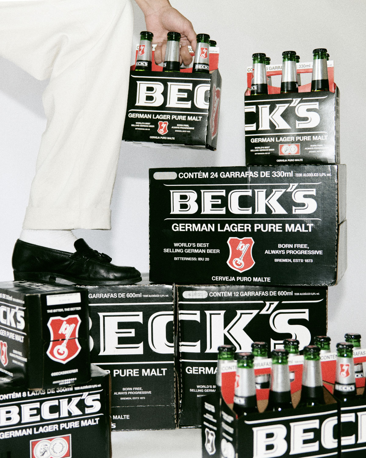
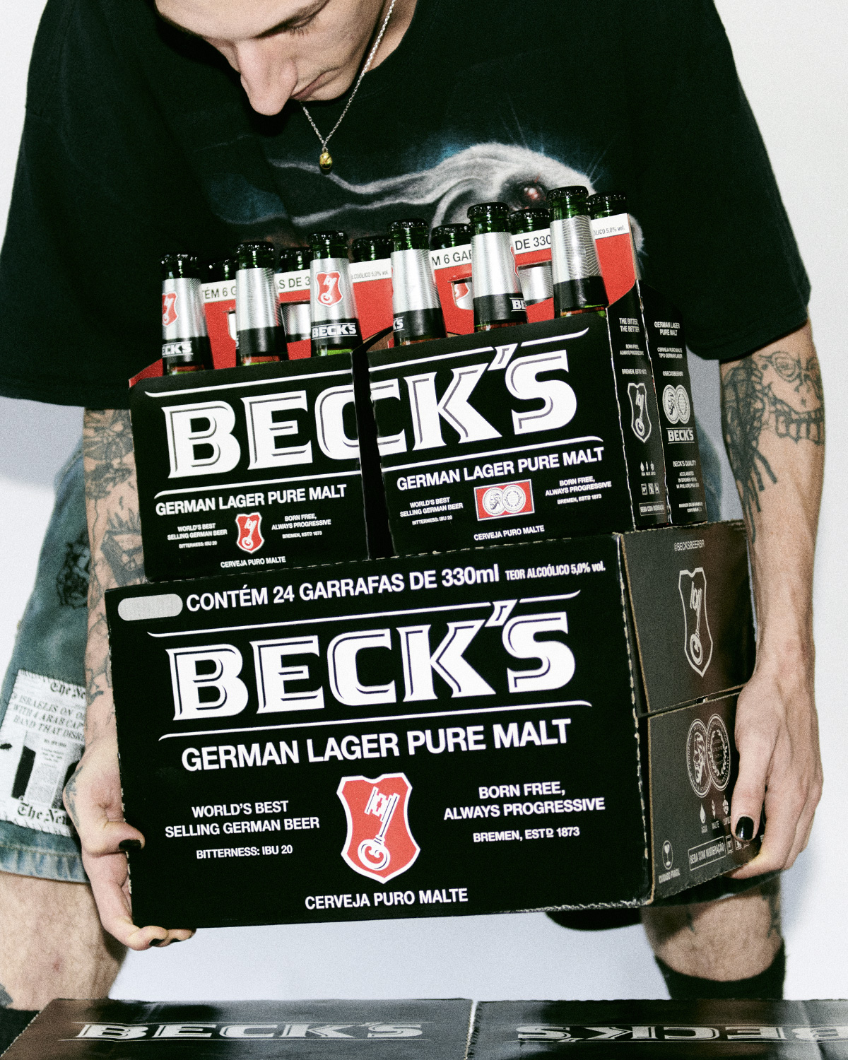
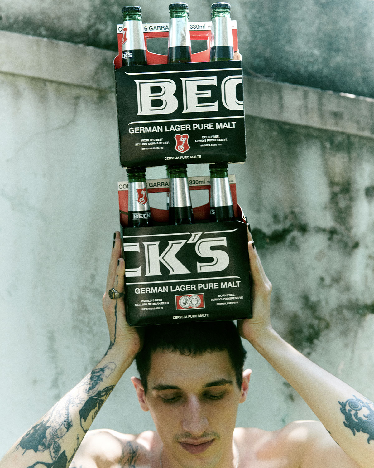
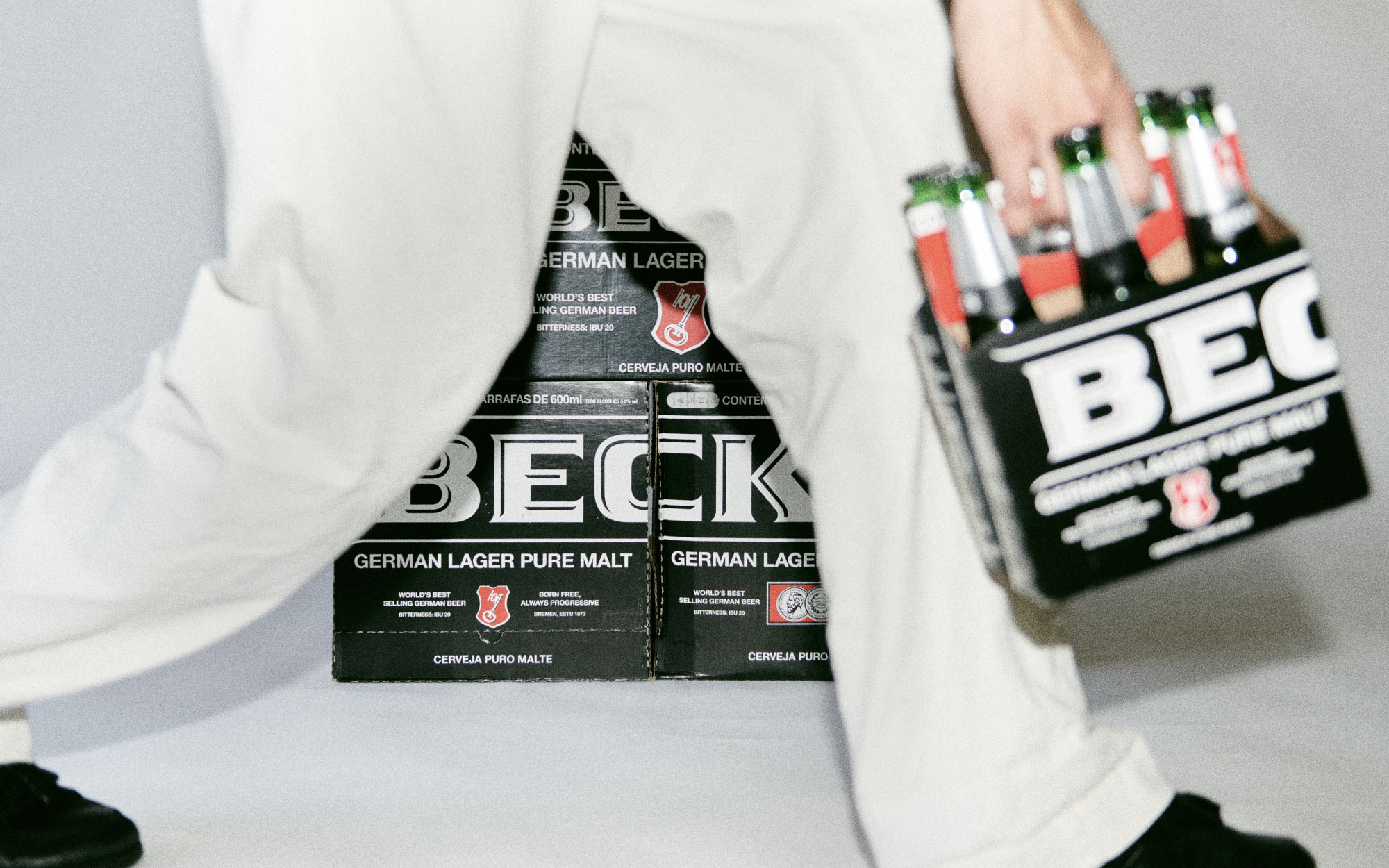
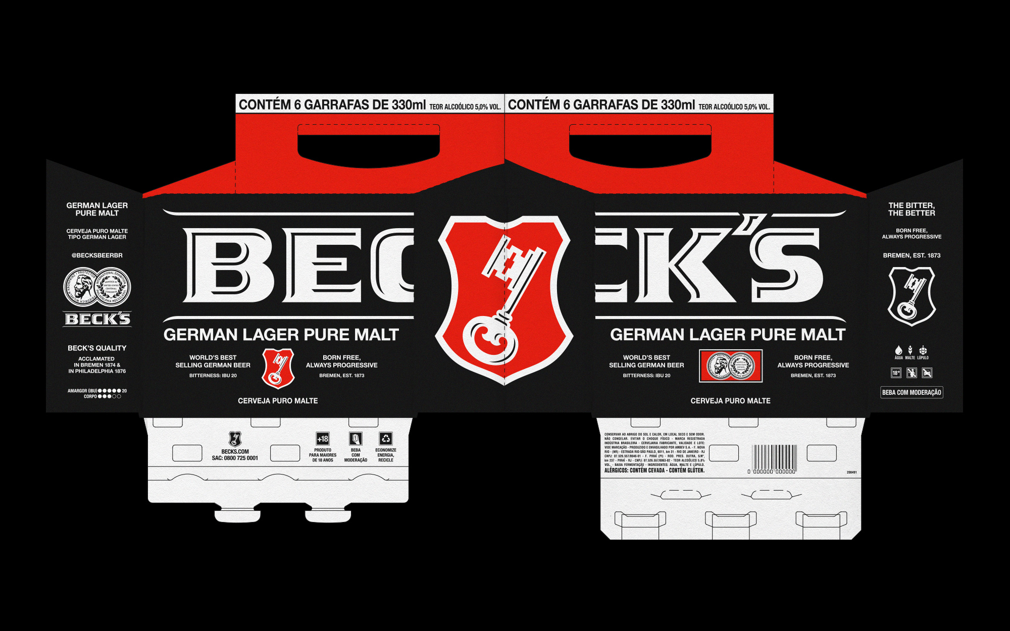
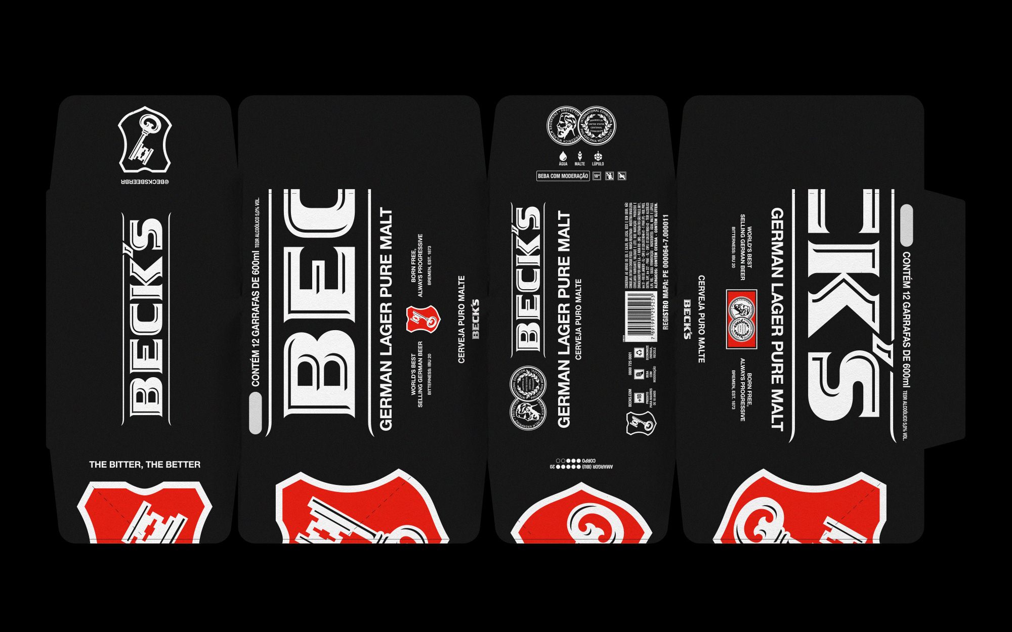
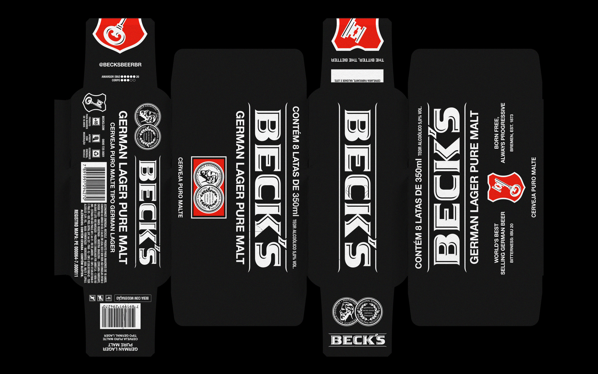
Positioned as a premium beer in the Brazilian market, Beck’s communication explores a duality between tradition, linked to its German heritage, and freedom, supported by the bitter flavor very characteristic of the drink. With that in mind, we designed a set of packs that evokes the progressive side of the brand but also stays loyal to its origins. Different from most of the packs in the market, Beck’s packaging has no photography of the product and no 3D effects of any sort. All the information is pretty straightforward but what plays a key role is the break of the hierarchy of elements in the compositions. Things that are usually neglected get incorporated to the layout (volumetry, number of bottles, ingredients, etc), typography is protagonist and the logo is divided in two, half on the front and half on the back.
It took more than two years since we designed the packs for them to reach the markets. Now we see them everywhere in Brazil and they are even being applied to other places such as Mexico and the United States. Beck’s Packs is probably the biggest project we ever did in terms of scale and reach. It is satisfying to see some ideas that we’ve been using in other smaller / independent projects coming to live through such an expansive canal.
Category: Graphic Design
Location: Brasil
Client: Beck’s Beer
Year: 2019-2021