Coral
Brand identity, website and communication for Coral an independent electronic music agency based in Brazil.
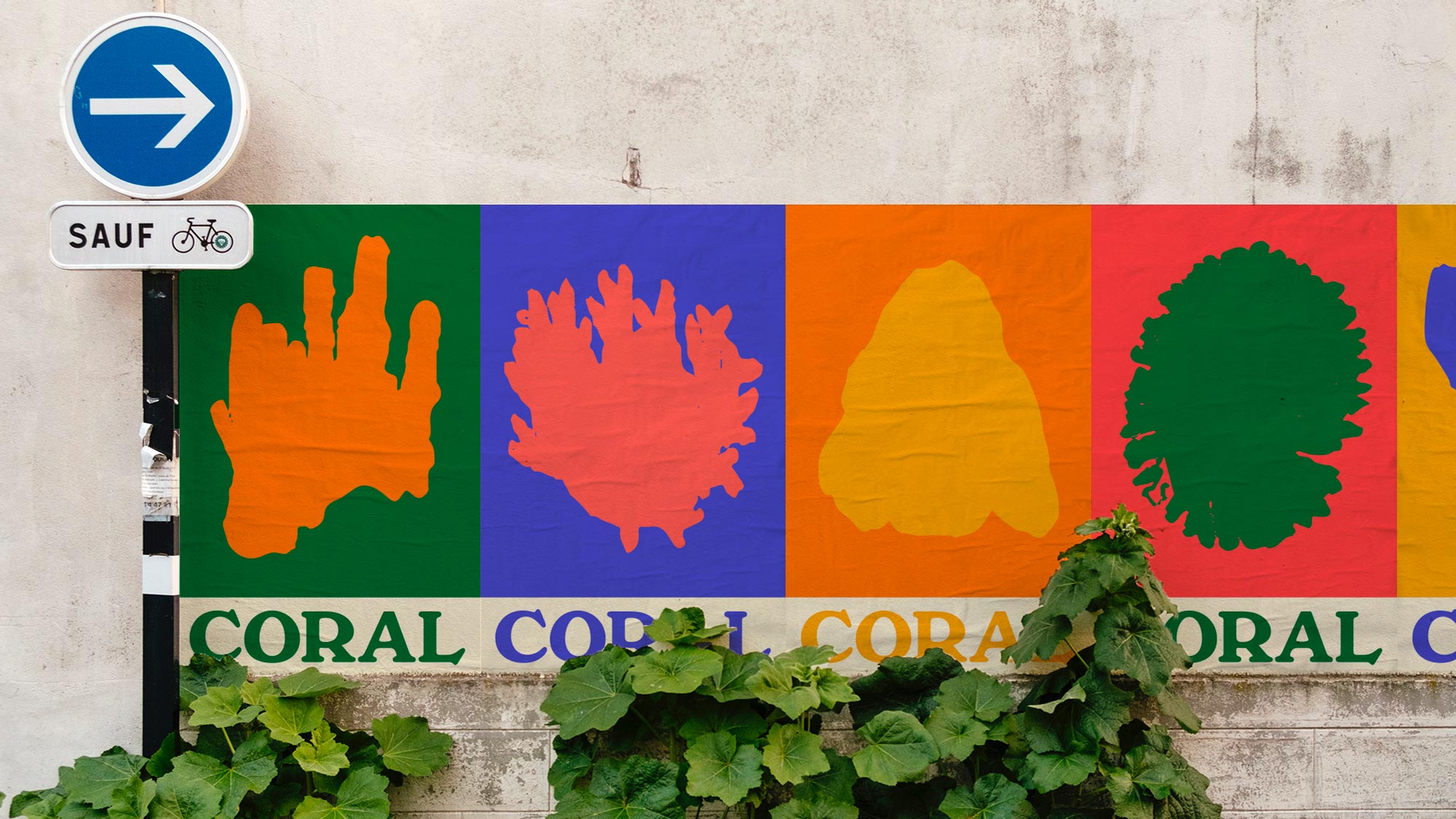
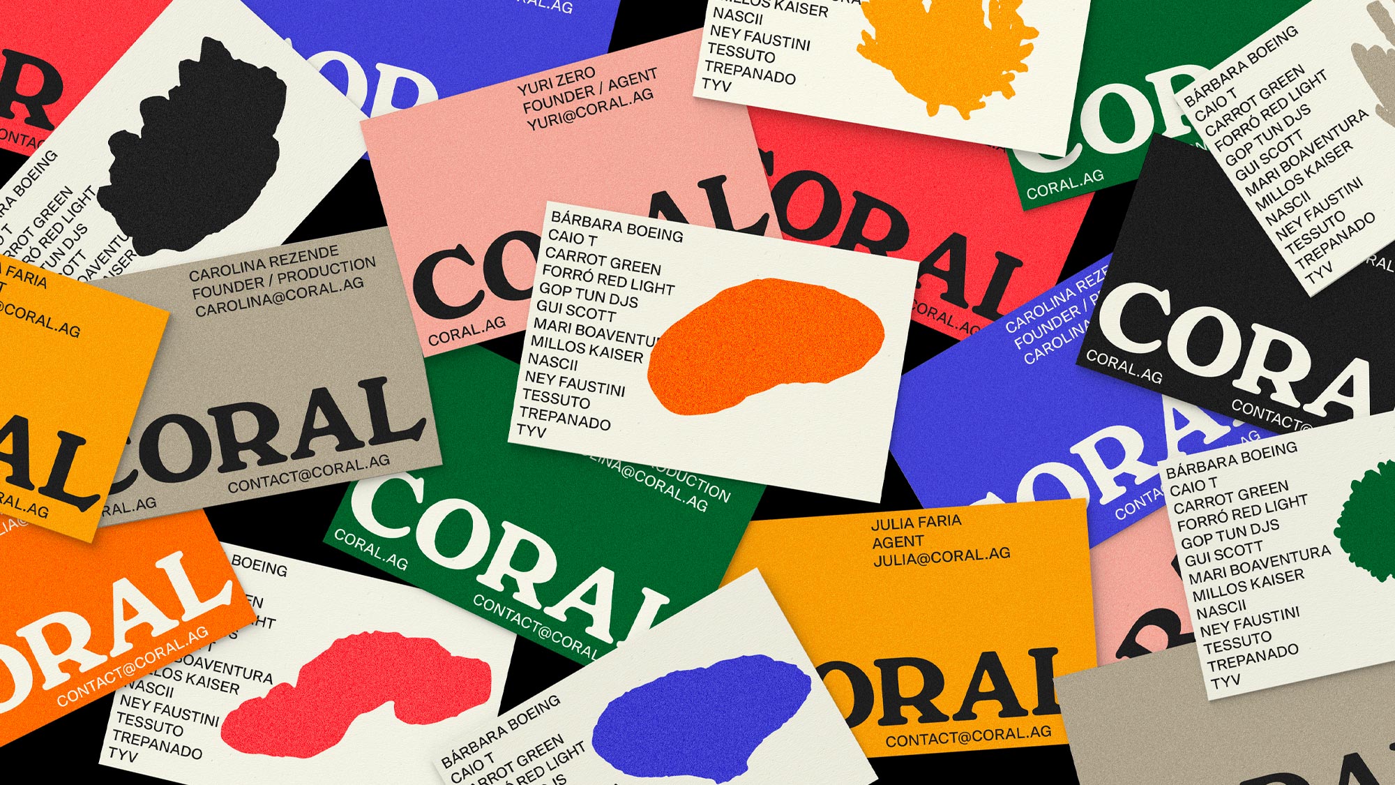
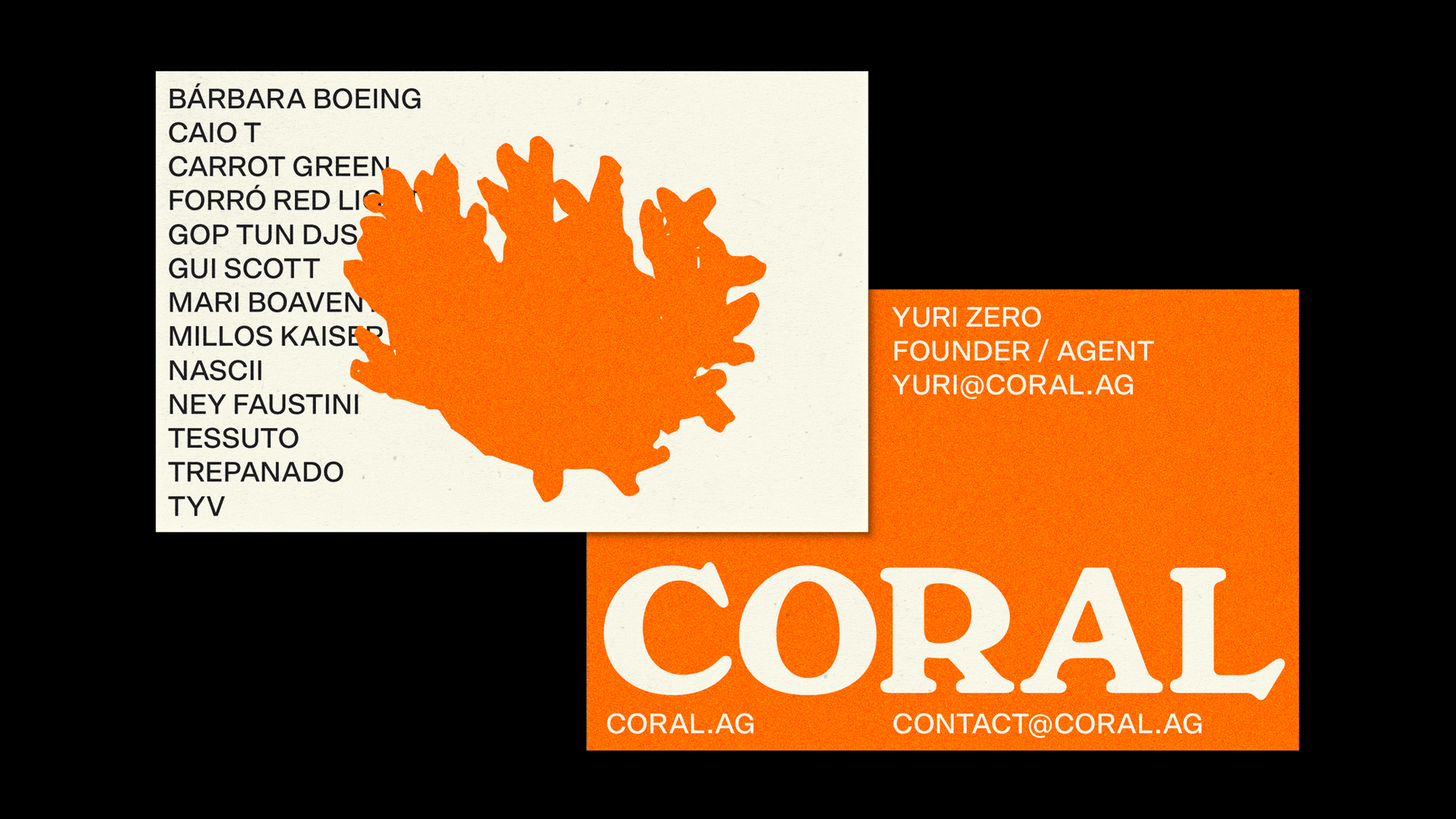
In Portuguese, “coral” stands for the sedentary coelenterate of tropical seas but also for choir, an organized group of singers. Both meanings had equal importance through out our creative process of designing the brand.
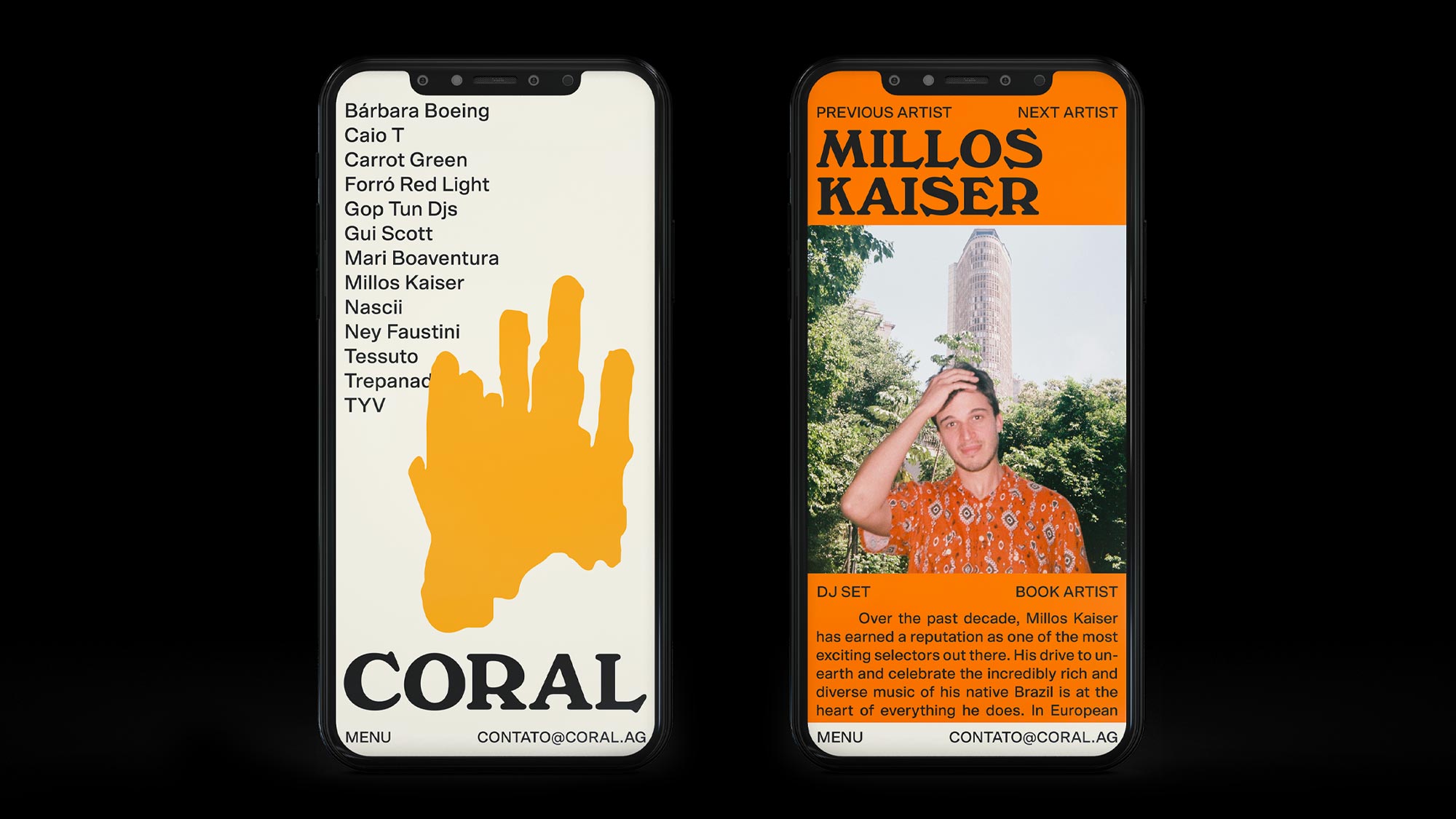
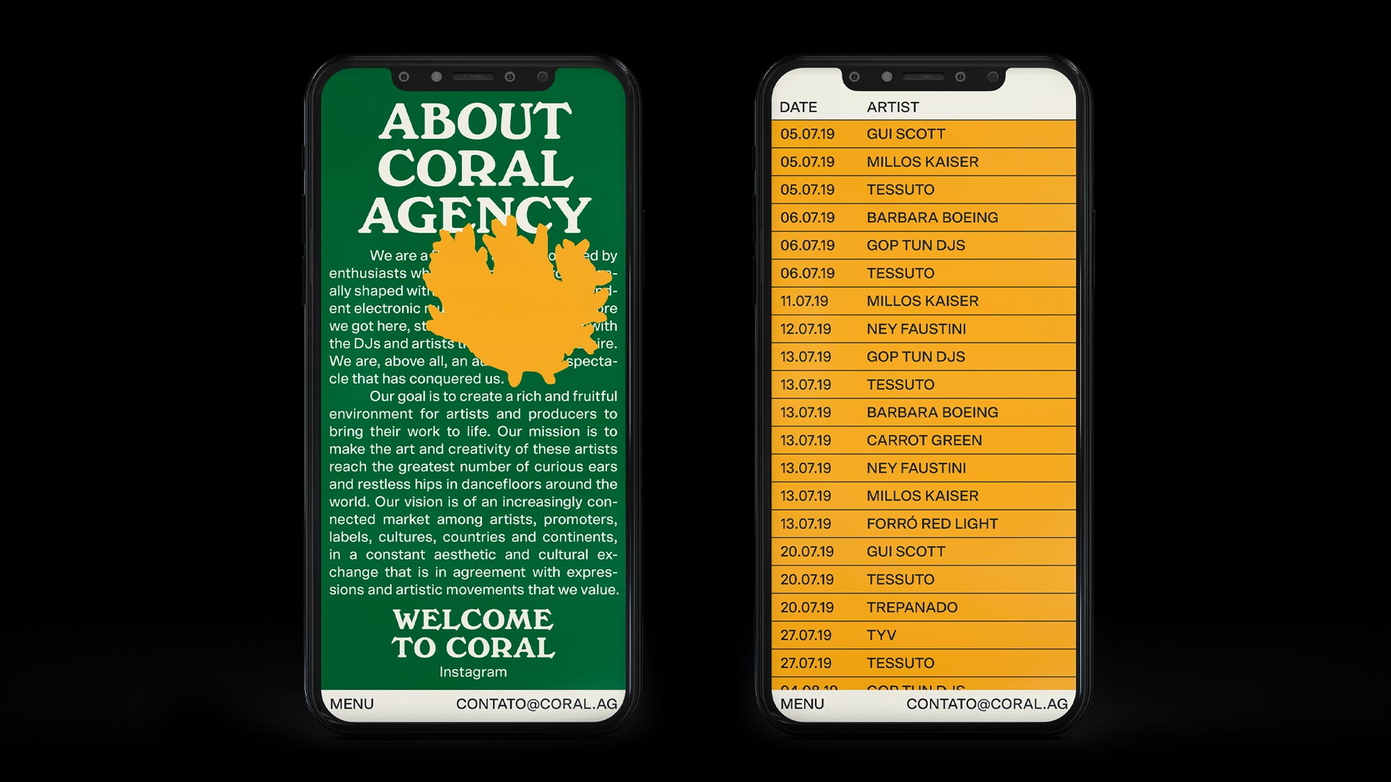
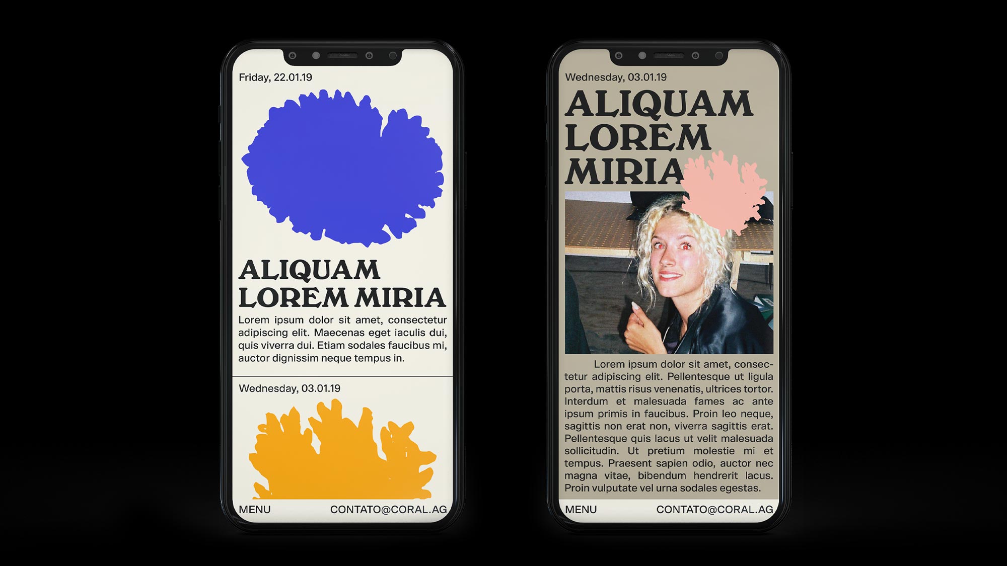
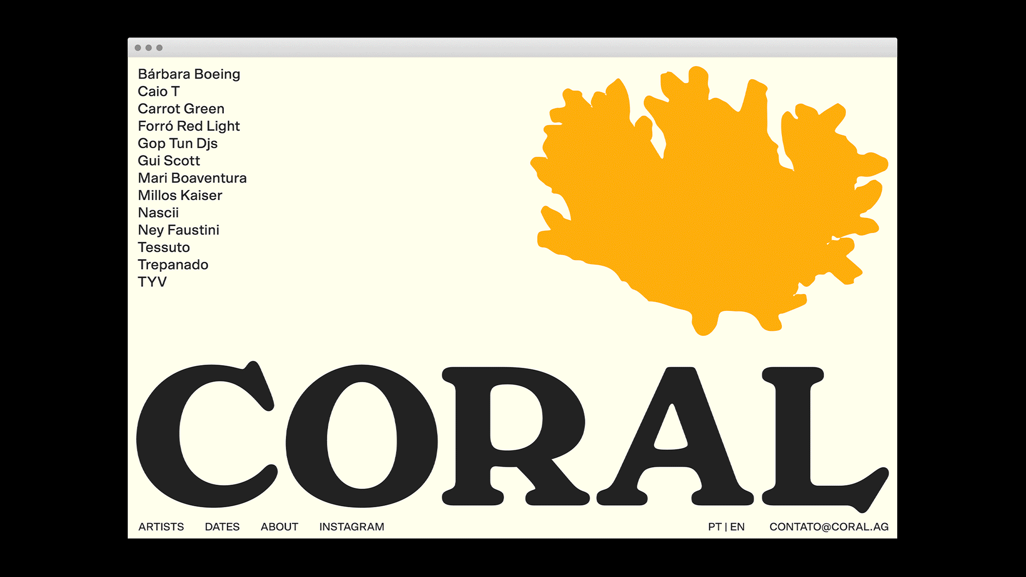
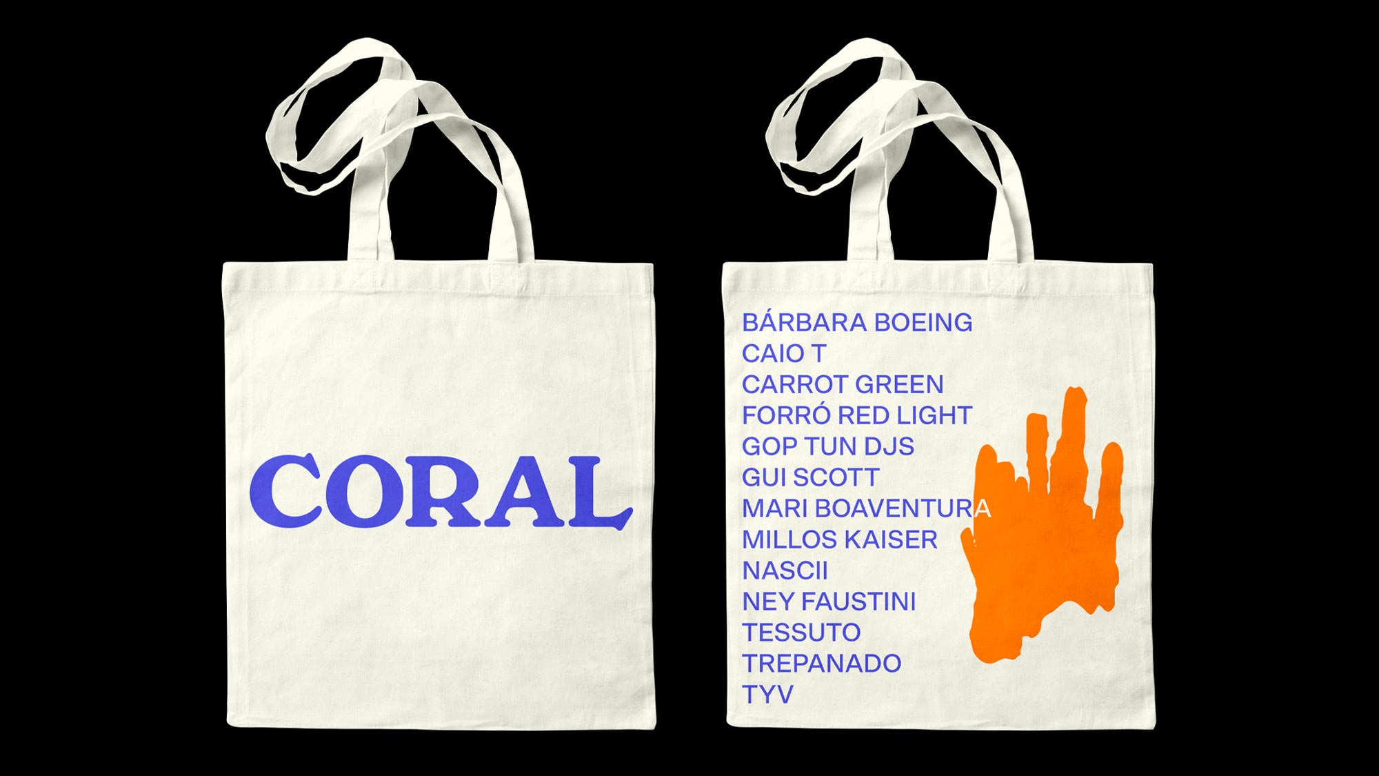
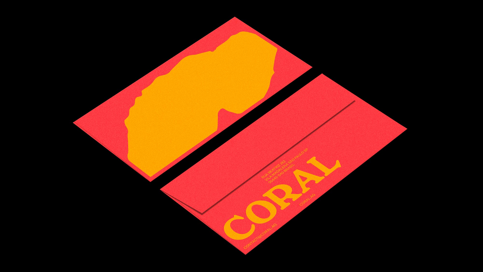
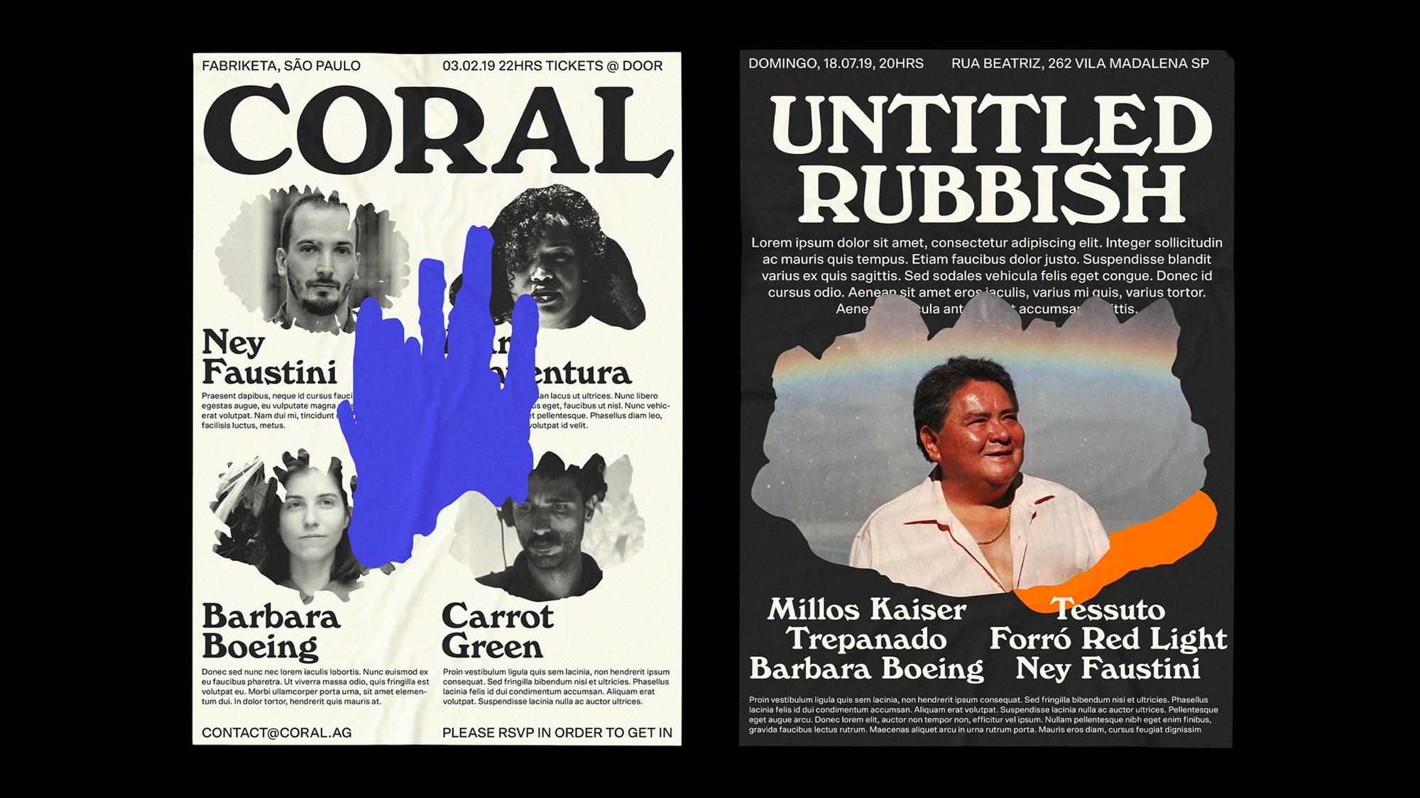
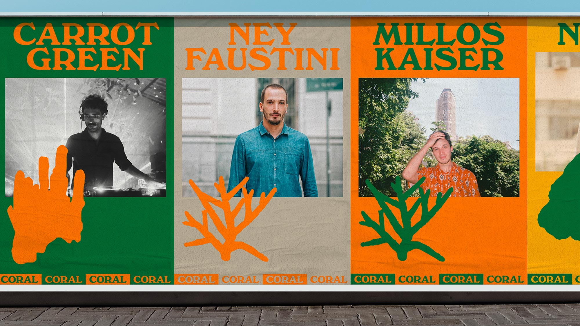
The marine coral, know for its magic colors, evoques the richness of species and diversity, an important characteristic of the agency that is not focused in just one style of electronic music, but rather, the plurality of styles found within their talents. Such qualities were represented in the identity by a large color palette made out of flashy primary colors balanced with neutral sandy tones. These values are reinforced by the silhouettes of sea corals themselves, which are animated in some digital material such as the website, throwing light at the ever changing style of the agency. The choir aspect which represents the organized and structured side of Coral, was brought into the identity by some straight composition rules such as a rigid grid, fixed text styles and classic hierarchies of content.
Category: Visual Identity / Webdesign
Location: São Paulo, Brazil
Client: Coral
Website: coral.ag
Coding: Fluxo
Year: 2019